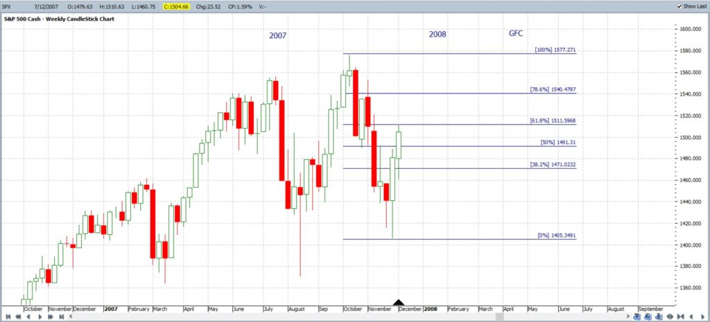
The S&P500 will be closely scrutinized in coming sessions to see whether price action might mirror what was experienced back in the last major market pullback of the Global Financial Crisis (GFC) 2008-2009. In this post I compare current price action of the S&P500 with charts from back in the GFC era and note key levels to monitor.
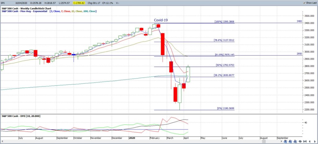
S&P500 weekly Current Covid-19: the chart below shows the current market pullback on the S&P500. The decline has stalled over the last three weeks and note how price action has bounced back to the 50% Fibonacci retracement level. The key 61.8% level lies near 2,950 and so the 2,900 – 3,000 level will be in great focus in coming sessions as traders watch to see how price reacts at this key level. You can read more about the importance of the 61.8% Fibonacci level in articles posted here and here.
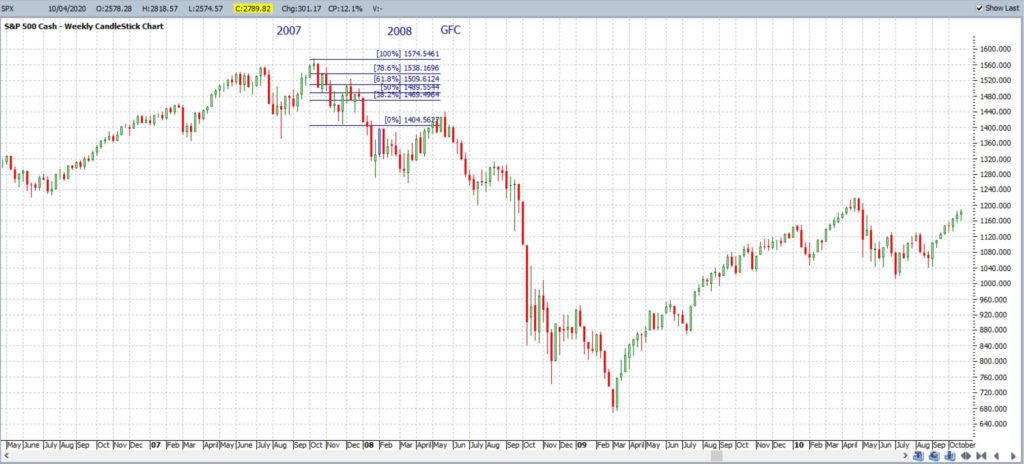
S&P500 weekly GFC First pullback: the chart below shows the S&P500 weekly chart for the period covering 2007 to 2009. The Fibonacci Retracement tool has been placed on the first pullback of this overall GFC swing Low move. Note where price action pulled back to with this first pullback: the 61.8% Fibonacci!
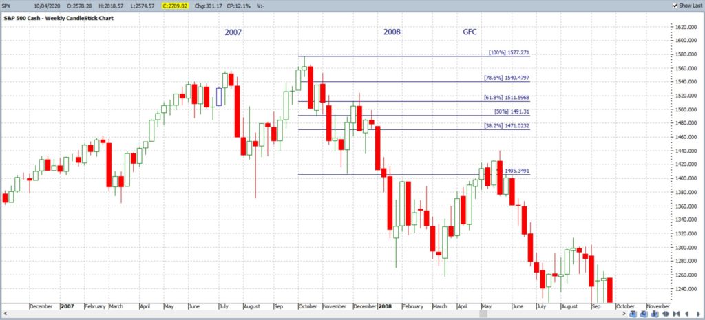
S&P500 weekly GFC First pullback: this is just an expanded view of the chart above making it easier to see this reaction at the 61.8% Fibonacci. For the GFC era, this first pullback stalled at the 61.8% Fibonacci and weakness then resumed. This type of bounce and subsequent failure is referred to as a Dead Cat Bounce.
S&P500 weekly GFC First pullback: this is a similar chart to the one above BUT I have removed the candles following the first test of this 61.8% Fibonacci level. I did this to make for an easier comparison to the current price action chart.
S&P500 weekly Current Covid-19: this chart has been copied again and was the first chart in this post but note the similarity to the GFC-era chart above. Analysts will be closely watching subsequent price action on the S&P500 to see if there is a test and / or reaction near the 61.8% Fibonacci level, circa 2,900 – 3,000. The big question being pondered here is whether this pullback is a V-shaped recovery or, simply, another Dead Cat Bounce?
S&P500 weekly GFC complete pullback: The chart below shows the complete GFC pullback and note how this endured for around 17 months. The recovery started in March 2009 and note where price rallied to before taking a decent break: The 61.8% Fibonacci retracement of this complete swing Low move!
Final Comments: The GFC market pullback lasted for around 17 months but didn’t travel in a straight line. There were small bounces along the way and these have the unfortunate name of Dead Cat Bounce. Another term for these rallies is Bear Market Rally. The first bounce of the GFC pullback reacted at the key 61.8% Fibonacci level and analysts / traders will be closely watching to see if the S&P500 reacts similarly at this 61.8% level, circa 2,900 – 3,000. The index has only reached back to the 50% level thus far. A failure at the 61.8% Fibonacci region would support the notion of a Dead Cat Bounce but a continued move above the 61.8% level would support the notion of a V-shaped recovery.
