Sunday 6th July
I have been reviewing the S&P500 and DJIA following their recent ascending triangle breakouts from daily chart patterns. I’ve noticed that potential targets on both of these charts line up exactly with targets taken from different breakout patterns on their monthly charts. I find that strangely spooky but reassuring at the same time! Please read on as I explain:
S&P500: the S&P500 made a bullish ascending triangle breakout on the monthly chart time frame back in April 2013. Potential targets for such breakouts are calculated from the height of the triangle pattern. The height of the pattern for the monthly S&P500 ascending triangle was 900. This was calculated from the move of 700 to approximately 1,600. Thus, the target for any potential bullish continuation could be expected to reach as far as 900 above the 1,600 breakout level. This would give a possible target of 2,500:
S&P500 monthly
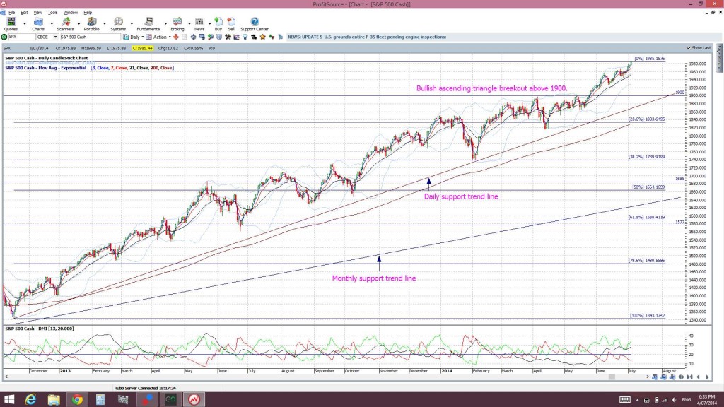
Now the S&P500 has been rather bullish since April 2013 and has actually been forming up within a smaller bullish ascending triangle pattern on the daily chart as well. There was a recent breakout from this triangle when price broke up through the 1,900 level:
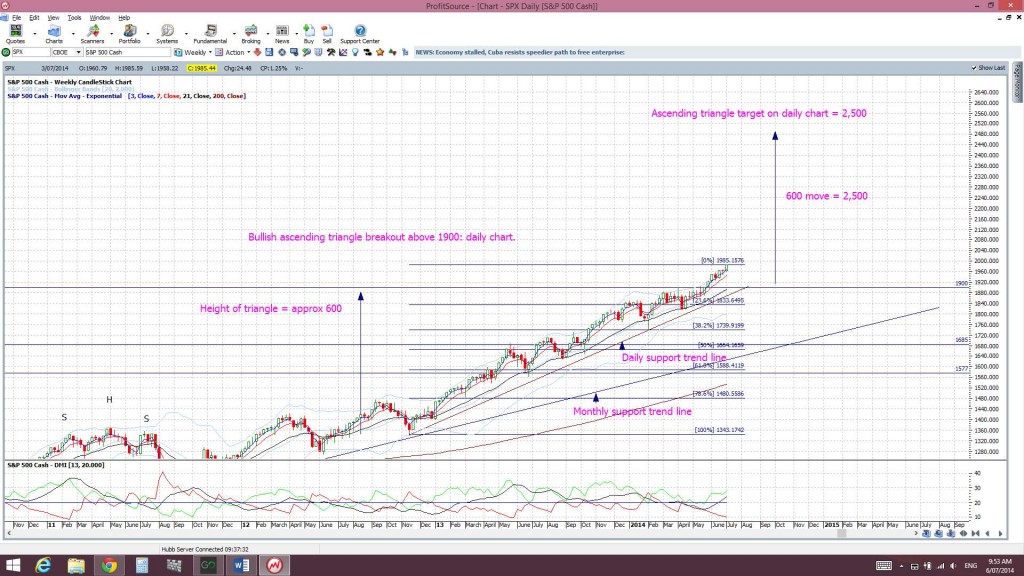
S&P500 daily
I thought I would calculate possible bullish targets for this smaller triangle breakout and see how it compares to the monthly chart target. The same maths applies here. The height of this smaller daily chart triangle was 600. This was calculated from a move of roughly 1,300 to 1,900. Thus, the target would be 600 above the 1,900 level. This projects a possible target for any bullish continuation at 2,500:
I find this parallel quite freaky and fascinating but, also, rather reassuring. The larger monthly chart ascending triangle breakout and the smaller daily chart ascending triangle breakout both have the same possible targets of 2,500.
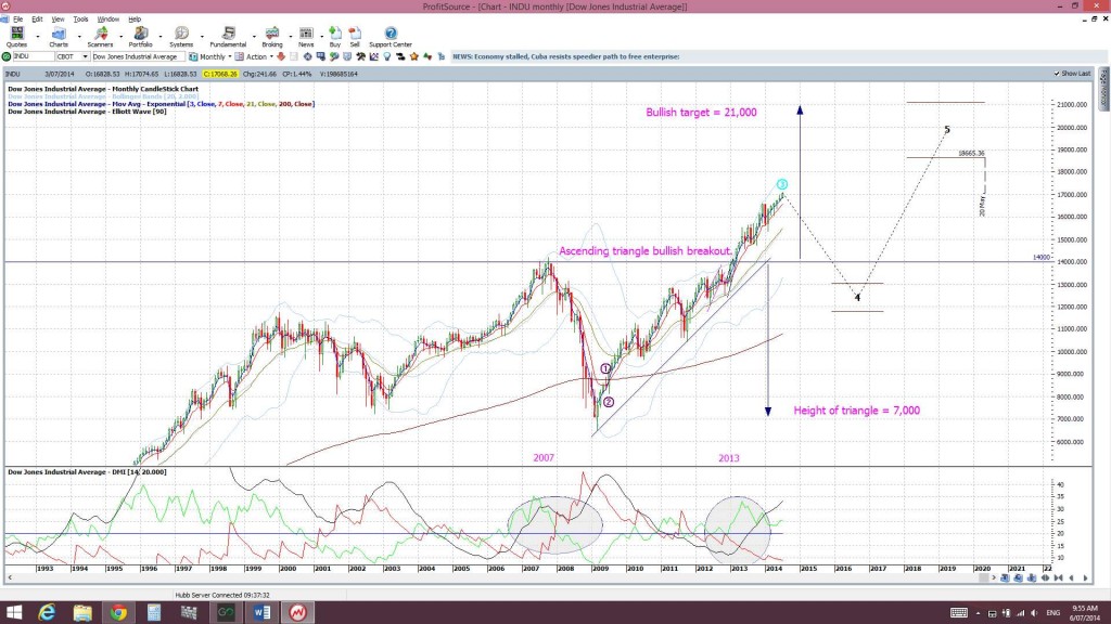
DJIA: It doesn’t stop there with the S&P500. The DJIA also made a bullish ascending triangle breakout back in March 2013:
DJIA monthly
Using the same mathematical logic here the height of this monthly ascending triangle was about 7,000. This was calculated from the move of 7,000 to 14,000. Thus, the possible target for any continuation could be expected to reach 7,000 above the 14,000 level. This gives a monthly chart triangle breakout target of 21,000.
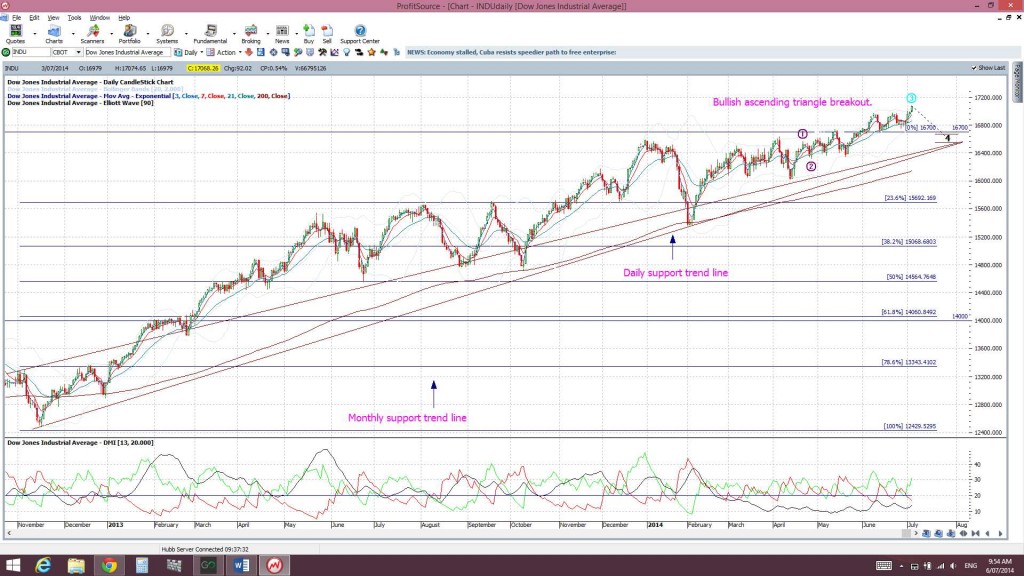
As with the S&P500, the DJIA has been rather bullish since then and had formed up into a smaller ascending triangle on the daily chart as well. The index recently broke up and out of this pattern when it broke through the 16,700 level. The height of this smaller, daily chart triangle was 4,300. This was calculated from a move of 12,400 to 16, 700:
DJIA daily
The projected target then for this smaller daily chart triangle breakout would then be 4,300 points above the 16,700 level and this equates to a target of 21,000:
This is exactly the same target as for the larger ascending triangle breakout on the DJIA monthly chart!
Summary: The S&P500 and the DJIA indices have made bullish ascending triangle breakouts on both their monthly and daily charts. The predicted targets for these breakouts on each index are the same value whether you look at the monthly chart pattern or the daily chart pattern.
- The S&P500 charts suggest 2,500 as a possible target for any bullish continuation.
- The DJIA charts suggest 21,000 as a possible target for any bullish continuation.
This is no guarantee that price will follow through to these levels but simply an extrapolation of possible targets for any bullish continuation based on technical theory. The fact that the two different charting patterns, on different time frames, for each index point to the same target is noteworthy in its own right though!


Merry ,
Good and great work, however no time indication for 21000 target ?
Kind regards
Sam Khawaja
Hi Sam,
Well, it could take a while.
The ascending triangles on the S&P500 and DJIA monthly charts took 4 years to develop. So, any bullish continuation could take the same period of time.
Also, I have no idea whether any pullback to test the breakout levels, 14,000 for DJIA and 1,577 for S&P500, might evolve before these two indices do peak.
Elliott Wave on both monthly charts suggests a pull back before peaking.
Cheers,
Mary
Mary Thanks,
So how do we make money ?
Kind regards
Sam khawaja
Well I am trading with more confidence as I buy dips and sell Puts until the S&P500 and /or DJIA daily trend line breaks.
Any daily trend line break on these will have me looking to a pull back to the quoted support levels.
A hold of these support levels would then have me buying much more aggressively.
I have already posted an article on the USA & Aussie stocks I am stalking. This can be found here @ https://www.tradecharting.com/2014/07/04/us-aussie-stocks-review-after-nfp-july-2014/