All four of the major US stock indices, the S&P500, DJIA, NASDAQ and Russell-2000, closed 2020 at all-time Highs which was a remarkable feat considering that the year was plagued with a once in a 100-year pandemic. The S&P500 is still lingering at an all-time High as I write this article; in the third week of January. Even the fact that the Democrats have gained control of the US Senate hasn’t dampened risk sentiment, as some had cautioned. However, the rally for US stocks from their Covid-inspired March 2020 Lows has extended for over 9 months now and this begs the question about whether this rally has more room to run.
The issues surrounding the transition of US Presidential power for the Biden administration, the devastating fallout from the Wednesday 6th January storming of the US Capitol and the ongoing Covid -19 situation are just a few Fundamental reasons for questioning the sustainability of this already extended US stock rally. However I am a Technical Analyst and, thus, look to the charts for clues about any potential trigger for a shift in risk sentiment and there is one warning in this space that is flashing for me.
In this article I will discuss the metric that has piqued my concern for this US stock rally; this being the Index of Percentage of Stocks above the 200 Moving Average.
The 200 Day Moving Average
Before discussing the Index of Percentage of Stocks above the 200 Day Moving Average I first want to reference the 200 Day Moving Average. This is a popular indicator used by traders for analysing longer term trends and is often used as the threshold for classifying whether an instrument is in an uptrend or a downtrend. A trading instrument that is above its 200 Day Moving Average is generally considered to be in an uptrend and, when below, is generally considered to be in a downtrend.
Longer Bull market periods generally have a greater number of stocks above the 200 Day Moving Average threshold and longer Bear market periods generally have a greater number of stocks below their 200 Day Moving Average.
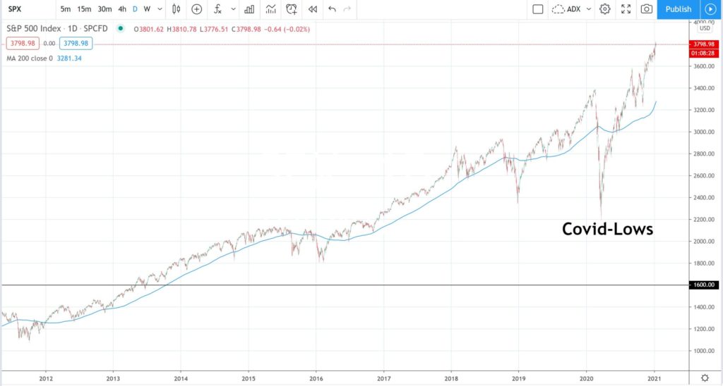
The chart in Figure 1 shows the S&P500 along with the 200 Day Moving Average indicator. Note the Covid-induced pullback that reached a Low in March 2020. Price action dipped below the 200 Day Moving Average during this period but recovered to trade above this by June 2020. The index has remained in an uptrend since then and remains above the 200 threshold.
Another feature I would like to highlight with this chart is how price action generally tends to trade rather close to the 200 Day Moving Average. Any periods of extension away from the 200 Day Moving Average tend to result in a mean-reversion style pullback to trade back nearer to the indicator. The point to note for now is that price action is currently fairly extended above the 200 Day Moving Average and, so, one has to wonder if some mean-reversion might be due.
Figure 1: S&P500 with 200 Day Moving Average
The Index of Percentage of Stocks above the 200 Day Moving Average
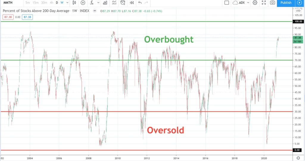
The Index of Percentage of Stocks above the 200 Day Moving Average is calculated rather simply as the sum of stocks above the threshold divided by the number of stocks in the particular index. The chart of this index therefore oscillates between 0 and 100. The chart in Figure 2 shows an example of the Index as found on the platform at TradingView. This chart dates back to 2002 and you can see how the Index oscillates across the 0 to 100 range.
Figure 2: Index of Percentage of Stocks above the 200 Moving Average
Overbought and Oversold
As is the case with other oscillator-style indicators, there are regions that represent being overbought and oversold. There are no strictly defined rules here but the overbought region could be described as the area above 70% and the oversold region could be described as the area below 30%.
The chart in Figure 3 shows these two regions highlighted on the Index chart.
Figure 3: Overbought and Oversold
One key observation with this Index chart is that when price action moves up into the overbought region it tends to eventually retreat and when price action ends up in the oversold region it, likewise, tends to retreat.
The chart in Figure 4 shows the maximum level achieved for this particular Index is near the 92.50 level and that price action tends to pullback, rather than chop along sideways, once this lofty level is reached.
Figure 4: Maximum region is near 92.50
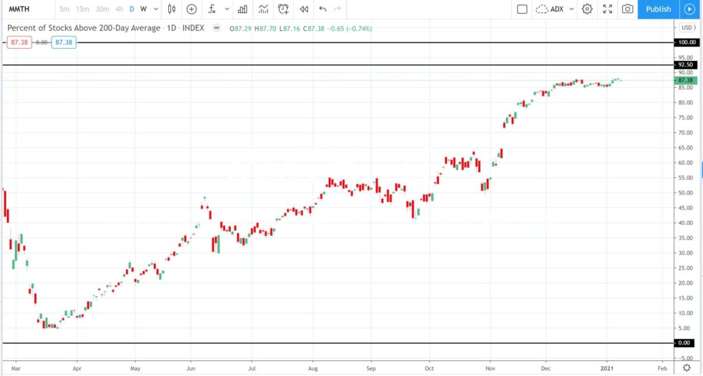
The chart in Figure 5 shows an expanded version of the Index so that you can see the recovery since the Covid-induced Lows of March 2020. Note how price action is very near to the maximum 92.50 region. There is a little room to move here before the 92.50 level might be reached but, as the earlier charts revealed, price action tends to retreat from this region once reached rather than stumble along sideways.
Figure 5: Expanded price action for % Stocks above 200 MA
S&P500
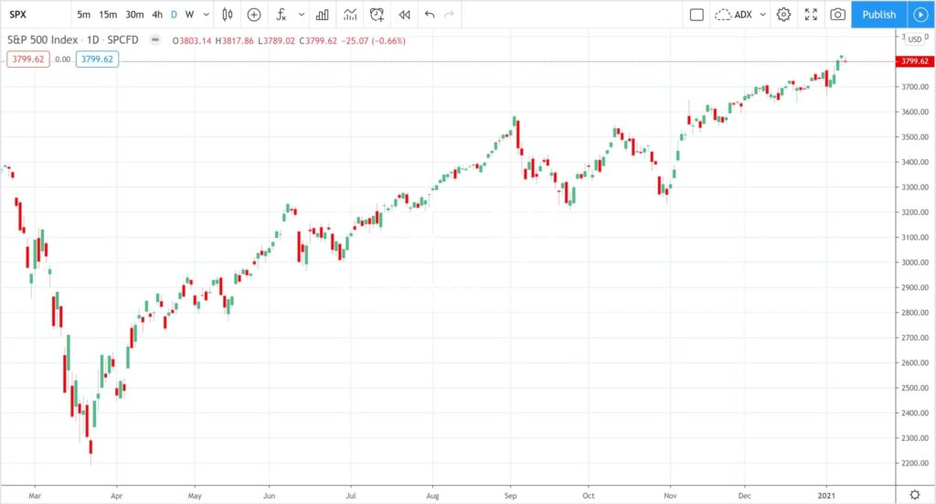
It is worth looking at the S&P500 index at this point and note how the chart in Figure 6 shows a similar price action trajectory since the Covid-induced March 2020 Low. The subsequent uptrend following the March 2020 Low has progressed now for over 9 months and so some pause or pullback would not surprise here; especially from a technical perspective. As I always remind traders, trends do not travel in straight lines ad infinitum; they tend to zig and zag their way through history.
Figure 6: S&P500 daily chart
S&P500 compared to Index of % Stocks above the 200 Day Moving Average
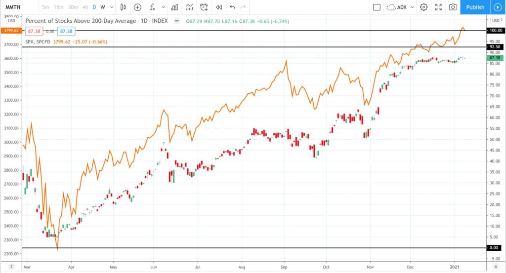
The chart in Figure 7 shows a comparison chart for the S&P500 with the Index of Percentage of Stocks above the 200 Day Moving Average and it is much easier to see their alignment on this chart. It is clear how both instruments have experienced an uptrend since March 2020 and with similar dips and troughs along the way.
Figure 7: S&P500 versus % Stocks above 200 MA
The Big Question?
The big question now is this: Given that the Index of Percentage of Stocks above the 200 Day Moving Average is near an all-time High and generally retreats from there AND that the S&P500 is generally closely aligned with this Index, is the S&P500 destined for a bit of mean reversion pullback activity?
Traders and Investors alike would be well advised to keep an eye on the progress of price action on the Index of Percentage of Stocks above the 200 Day Moving Average so as to watch for signs of any retreat as this might suggest a similar trajectory for the US stocks in general. Past performance of price action on charts can never be regarded as a guarantee about future price action, however, warnings as described above are worth noting to assist with risk management for any open trading or investment positions.
Concluding Comments
Technical Analysis is not a perfect Science and so there are no guarantees with how the S&P500 index, and stocks in general, will move from here. However, given that this latest trend on the S&P500 has run for 9 months it would not be a surprise to see a pause or pullback, even if this is only temporary. The Index of the Percentage of Stocks above the 200 Day Moving Average is near its all-time High region and history would suggest a pullback could be expected after this lengthy bullish run, and, especially if the maximum 92.50 level is reached. It would be prudent to keep an open mind here with the next major move for stocks in general and to make sure risk with any open positions is managed appropriately.

