There has been a bit of trading interest of late about the performance of the NASDAQ and whether this Index has run its course for the time being. I have been very bullish on the NASDAQ since around 2015 when it finally started to break free of it previous all-time High region, circa 5,200. I still have the PowerPoint presentation I gave to a group of traders at a brokerage firm in February 2015 that is testimony to this fact. This bullish run on the NASDAQ started well before 2015 though; it actually started from the Lows printed after 2008-2009 Global Financial Crisis, as did the recovery with many global stock Indices. So, a pause here for the NASDAQ would not be a surprise but some may ask, ‘why at this particular juncture? You might be surprised to find that a rather obvious clue was to be found in charts of the NASDAQ and S&P500, as I will elaborate on in this article.
Index Charts
Before getting into any detailed discussion it is worth looking at the individual charts of both Indices; the S&P500 and NASDAQ composite.
S&P500:
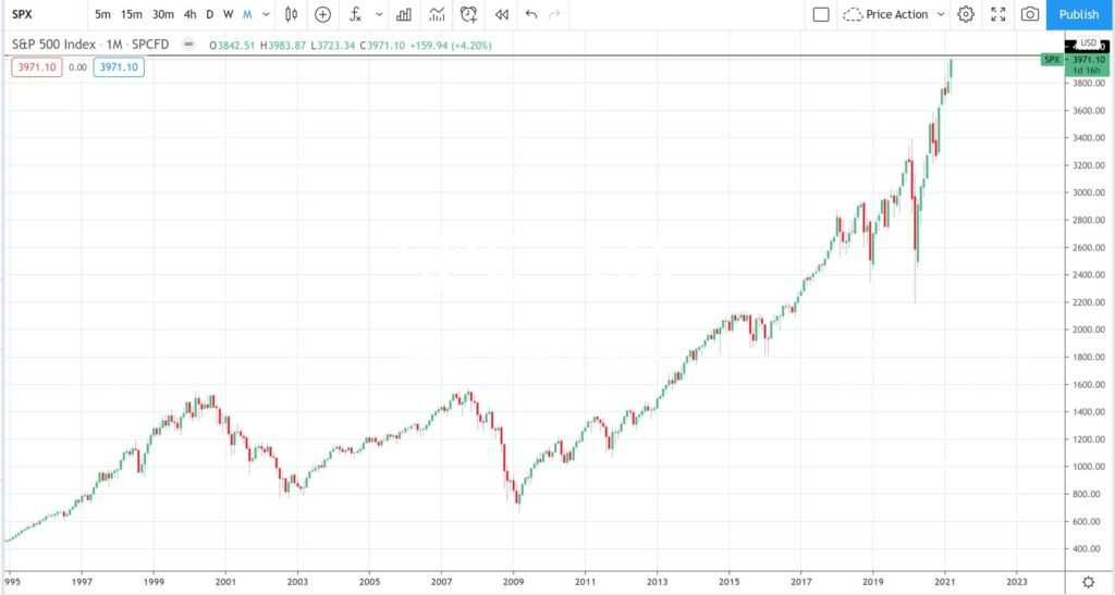
The monthly chart in Figure 1 spans back to just after 1995. The first peak corresponds to the 2000 era Dot Com Bubble, with subsequent burst, and the second peak corresponds to the 2008-2009 Global Financial Crisis (GFC). You can see that the Index has been in an essential uptrend since the recovery off the GFC Low, early 2009, and this is evident with the print of higher Lows and higher Highs since that time. Even the recent Covid-19 inspired pullback has not really broken this overall uptrend. The S&P500 is, at the time of writing this article in late March 2021, navigating just under the whole-number and psychological 4,000 level so this might give the Index some pause.
Figure 1: S&P500 monthly
NADSAQ:
The monthly chart of the NASDAQ in Figure 2 covers a similar time period and the first peak corresponds to the 2000 era Dot Com Bubble, and subsequent burst. Note, though, how the recovery was less pronounced for this Index than the S&P500 though during the period leading up to the 2008-2009 GFC. However, post GFC, the NASDAQ has carved out a similar recovery pattern as the S&P500. The NASDAQ is, at the time of writing this article in late March 2021, navigating just under the whole-number and psychological 14,000 level so this might also give the Index some pause here.
Figure 2: NASDAQ monthly
Comparison Charts
The two charts, in Figure 1 and 2, do not give away many clues about the current and relative progress of the NASDAQ index. The beauty of modern software and charting packages is, however, that they are rather versatile and can enable you to do this assessment quite easily; as you will see in this section with the analysis of a Comparison chart of the NASDAQ versus S&P500.
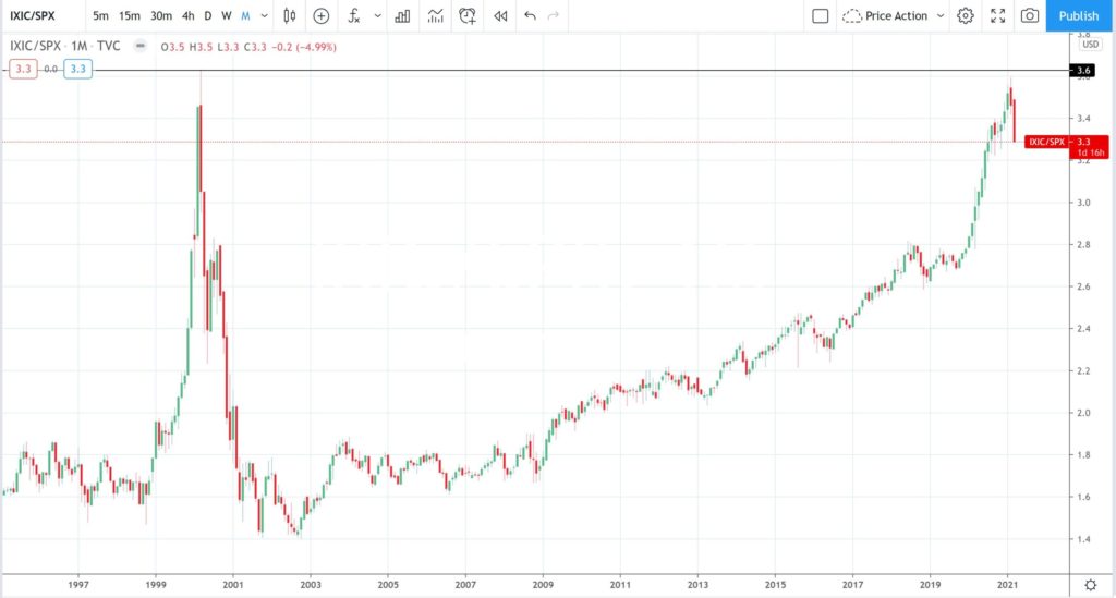
NASDAQ versus S&P500: monthly
The chart in Figure 3 is a Comparison chart that shows the performance of the NASDAQ relative to the S&P500 and, in my opinion, it is most striking. Price action up until 1999 showed sideways activity and this is best interpreted as both Indices performing at a rather similar pace and in a rather similar direction. Note the sharp rise, though, from 1999 through to 2000; this was the period referred to as the Dot Com Bubble or Tech Bubble where the NASDAQ greatly outperformed the S&P500. You can do your own research to find out the fundamental reasons for this rapid rise with the NASDAQ but my focus here is entirely technical: to analyse the charts and to try and make some valid assessments.
The out-performance of the NASDAQ, relative to the S&P500, came to a drastic halt in 2000 and the sharp reversal of the trend line reflects this reversal.
The period from 2003 to 2009 shows an essential sideways pattern where you could conclude that both Indices were again performing fairly similarly. It wasn’t until after the Global Financial Crisis Low, of early 2009, that the NASDAQ started to outperform the S&P500 again. This out-performance is evident by the print of higher Lows and higher Highs from 2009 to current time.
The really striking feature though, at least it is as far as I am concerned, is that the recent pause in the NASDAQ’s relative performance has come at the exact same level as the pause from back in the 2000 Dot Com Bubble! So, this pause with the NASDAQ may not be as random as it first may have seemed. If one had been looking for some signal for when the NASDAQ out-performance might subside then this chart may have given you that clue: a previous all-time High on a chart is always going to be an obvious level to watch for any reaction. Anyone who was watching this comparison chart of the NASDAQ versus S&P500 would have been in a good position to monitor for this latest NASDAQ pause.
Figure 3: NASDAQ versus S&P500 monthly
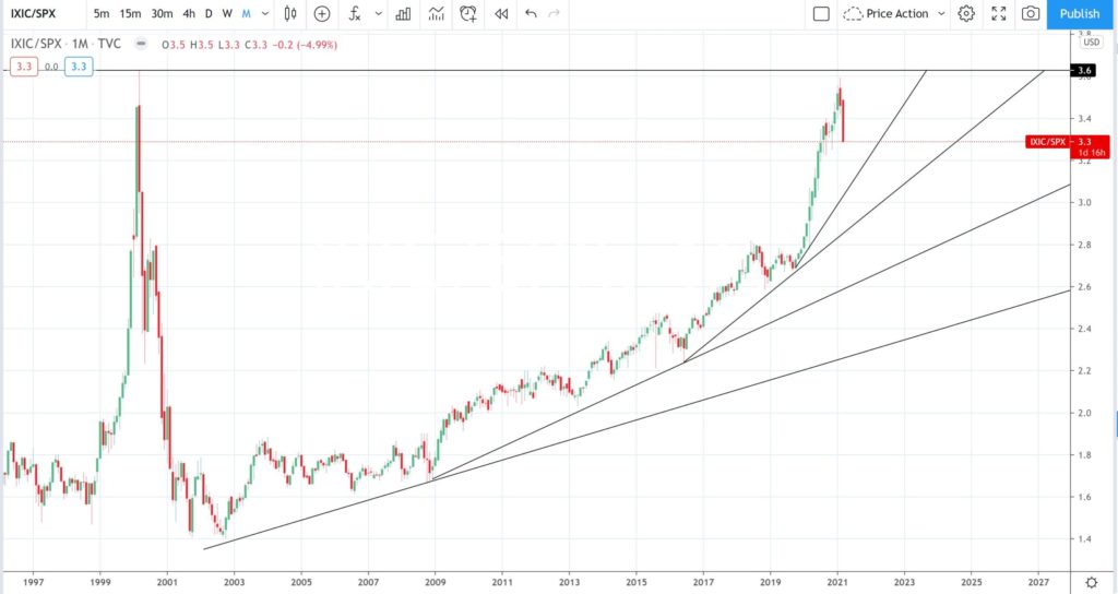
NASDAQ versus S&P500: monthly + trend lines
The chart in Figure 4 shows the same as in Figure 3 but with added trend lines and there are many different tangents that one could monitor here. The previous High, circa 3.6, will remain in focus and will be the level to monitor for any breakout to the upside. Such levels can often offer considerable resistance though so watch for any sideways activity under this resistance zone. Or at worst, watch for any deeper pullback, as happened following the last print of this High in 2000.
Figure 4: NASDAQ versus S&P500 monthly + trend lines
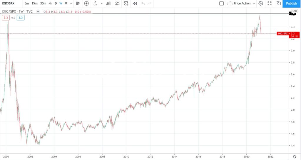
NASDAQ versus S&P500: weekly
The chart in Figure 5 shows a weekly time frame for the NASDAQ versus S&P500 and doesn’t add much extra value. However, at this point in time it might be worth looking for any overall type of chart pattern here. Some may see a bit of a skewed ‘Cup’ type of pattern and others may see a type of ‘Ascending Triangle’ pattern. Either way you look this, both patterns are generally considered to be bullish continuation patterns and so that is something to keep in mind here; any break and hold above the previous all-time High region of 3.6 would be considered a bullish signal indeed.
Figure 5: NASDAQ versus S&P500 weekly
NASDAQ versus S&P500: weekly + Fibonacci
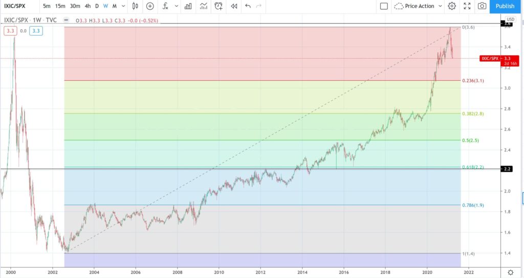
The chart in Figure 6 shows the same weekly chart as in Figure 5 but with an added Fibonacci retracement. Price action has currently paused at the previous all-time High and it so is worth assessing potential retracement levels, in case there is a pullback. Fibonacci levels are popular ones to monitor and it is widely accepted that an uptrend remains intact until such time as the 61.8% Fibonacci is broken. Note how the 61.8% Fibonacci level for this entire swing High move, from late 2002 to current time, is down at a horizontal level where there has been a fair bit of previous reaction, circa 2.2. This would be the level I would monitor for any further reaction or pause if there is a deep pullback.
Figure 6: NASDAQ versus S&P500 weekly + Fibonacci
Concluding Comments:
Both the S&P500 and NASDAQ indices have recovered off their Lows since the 2008-2009 Global Financial Crisis. However, the comparison chart of the two Indices reveals subtle difference between the two and highlights three key features. These three features being that the:
- Pace of recovery for the NASDAQ has outperformed the S&P500 since early 2009.
- NASDAQ has now paused, relative to the S&P500, at a similar level to that printed back with the 2000 Dot Com peak.
- Overall chart could be viewed as a bullish-continuation Ascending Triangle or a skewed Cup pattern.
They say history doesn’t repat but it often rhymes and it looks like this might be the case here with the comparison chart of the NASDAQ versus S&P500 showing a pause at the previous all-time High. The comparison Index chart has been useful to put this latest pause with the NASDAQ into a greater context and it also offers some levels to monitor into the future: the previous all-time High of 3.6 and the 61.8% Fibonacci retracement level of 2.2.


