This article was prompted by a tweet I saw this morning posted by Linda Raschke. where she raised the issue of Growth versus Value and whether there might be some shift evolving in their relationship to each other. This concept intrigued me and got me exploring charts for some further clues about this relationship, and, hence this post. The main point to keep in mind as you read on is that I am reviewing this Growth and Value phenomenon from a Technical (charting) perspective and not from a Fundamental one. To this end I have used the Growth ETF: VUG and Value ETF: VTV for my charting comparison.
Growth and Value are terms used to represent two different styles of stock market investing:
- Growth is a generally accepted term used to refer to those stocks that are fundamentally strong and grow in value at a higher rate than the broader market. Such companies generally invest all of its earnings back into the growth of the company and don’t pay any dividend or they pay very little dividend.
- Value is generally accepted to refer to those stocks that trade at a lower value relative to its fundamentals ( eg: P/E, Dividends, Sales) and to its peers. Such companies generally pay more dividends, perhaps in a 3% range, and they don’t anticipate substantial growth to justify putting all the earnings back into growing the company.
A review of some literature reveals that the key differences between Growth and Value stocks can be summarized as per the table below.
Growth versus Value: key differences:
| Investment Approach | Metric |
||||||
| Price | P/E ratio | P/B ratio | Risk | Dividend Yield | Market Cap | Examples
|
|
|
Growth
|
Rel High | High | High | Higher: due to potential for pullback | Low | Often Large Cap | AMZN, FB, GOOG, MSFT
VUG (ETF) (Source: here) |
| Value | Rel Low | Low | Low | Lower: as less expensive c/- peers | Relatively Higher | Often Small Cap |
XOM, ANF, AA, AEO, VTV (ETF) (Source: here) |
The existence of a single ETF to represent both Growth and Value stocks makes for easier comparison. I have used the ETF of VUG to represent Growth and the ETF of VTV to represent Value. Some charting software allows for direct comparison between two entities and I have used Trading View for my purpose here today. The charts below show a comparison of VUG to VTV which represents Growth versus Value. As always, I adopt a top down approach with my analysis and start from the monthly time frame before drilling down to lower time frames.
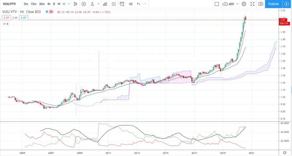
VUG / VTV monthly: this is probably the most interesting of the charts. The monthly chart shows that price action has been in an uptrend since late 2006 with a print of higher Lows and higher Highs. This movement means that Growth stocks, as represented by the VUG ETF, have been performing better than Value stocks, as represented by the VTV ETF, during this period. If both both Growth and Value stocks were performing at the same rate then, it is my understanding, you would expect the trend-line to be horizontal along the 1.0 line.
VUG / VTV traded downward and below the 1.0 level prior to the 2007-2009 Global Financial Crisis but has trended upward and above 1.0 essentially since the end of this period.
This VUG / VTV uptrend was more gradual for the 10 year period from 2007 to 2017 but has been much more marked since 2017 and especially so since 2019. The trend since 2020 would be best described as exponential. Note, also, how far price action has extended above the fluid Support / Resistance zone represented by the Ichimoku Cloud.
The period of 2007 to 2019 was peppered with numerous bearish monthly candles but note how there have only been two bearish monthly candles since 2019! The current monthly candle is shaping up as bearish but has yet to close.
This recent exponential rise and significant move away from the Ichimoku Cloud have me wondering if a pause might be due; some mean reversion? Trends don’t travel in straight lines unabated and there can often be a pause or pullback even if the dominant trend, in this case upward, is ultimately to continue. I will be watching to see how this monthly candle eventually does close for clues.
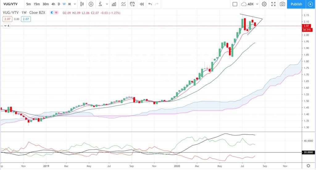
VUG / VTV weekly: the weekly chart shows this more recent exponential rise in greater focus. Note the momentum that has been evident with this move since the start of 2020. The bottom pane of the chart shows the ADX Momentum indicator with the ADX being the black line; the ADX has been elevated and well above the 20 threshold for most of this year. The last few weekly candles reflect that some fatigue might be setting as price consolidates so watch for any pullback on the ADX:
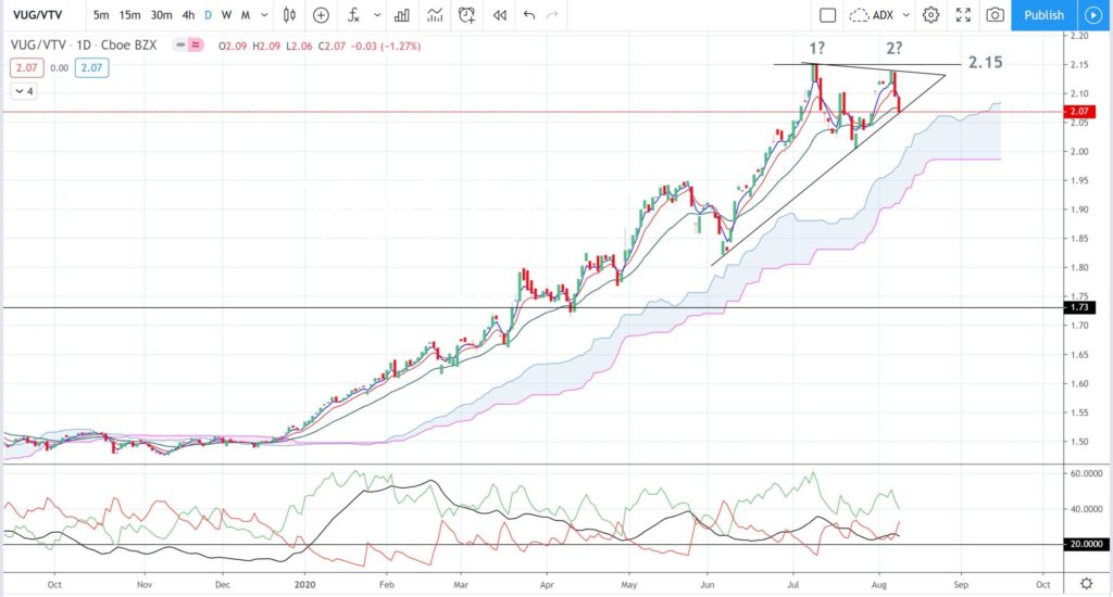
VUG / VTV daily: Linda Raschke made reference to a possible daily chart Double Top in her Tweet this morning and the same potential is evident on the daily chart below. This time frame chart shows the consolidation with declining ADX momentum in greater detail. Note, also, how bullish momentum, shown with the +DMI (green line), is waning and bearish momentum shown with the -DMI (red line), is ticking upwards. Clues about the next move might be gained from watching for any triangle trend line breakout that triggers with increasing ADX momentum.
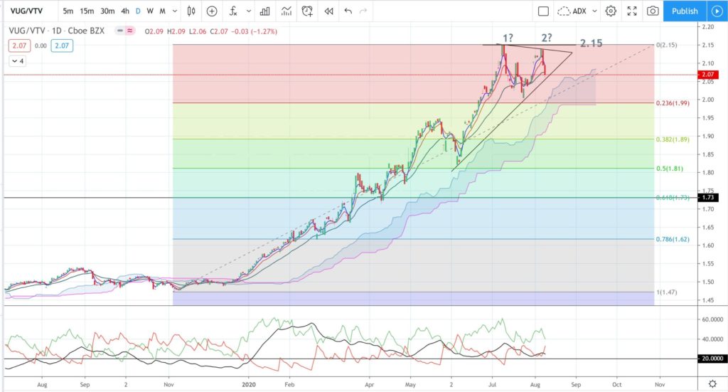
VUG / VTV daily + Fibonacci: Application of a Fibonacci retracement to capture the whole of this 2019-2020 swing High move shows the popular 61.8% level to be down near 1.73 and this was also a region of some price action reaction:
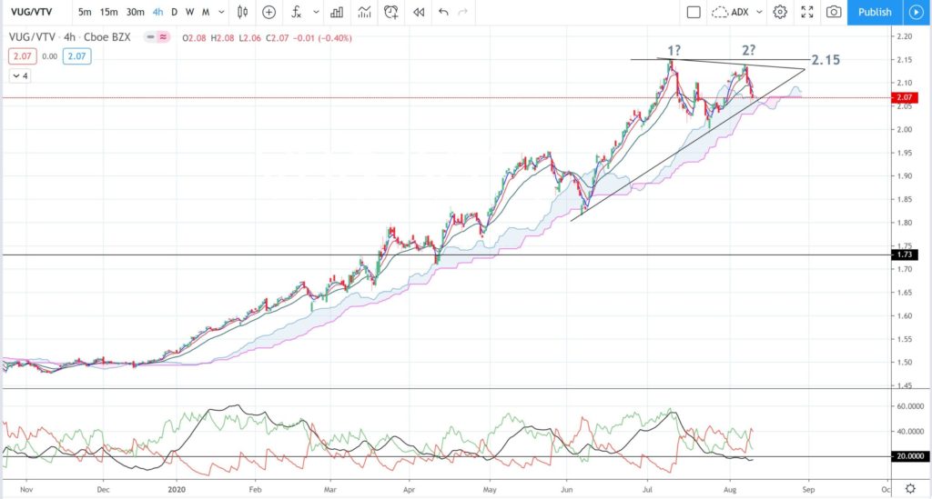
VUG / VTV 4hr: the 4hr chart shows that price action has been above the support of the Ichimoku Cloud for much of 2020. There have been a few dips into the Cloud but only 3 of the 4hr candles printed below this support.
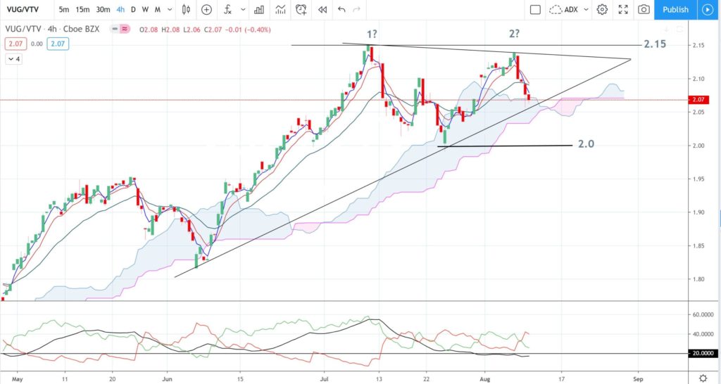
VUG / VTV 4hr expanded: this expanded chart shows recent price action and momentum more clearly. The trend remains up for the time being as price action continues the print of higher Lows and higher Highs. However, ADX Momentum has been declining since mid July and has been below the 20 threshold for much of August thus, watch for any new triangle trend line breakout that evolves with rising ADX momentum above 20. Any bearish trend line breakout would bring the 2.0 level into greater focus as any new close and hold below this level would help carve out a lower Low and could signal the start of a potential reversal:
Putting this all together:
The ratio chart of Growth versus Value, shown by way of the comparison of VUG / VTV, has been in an uptrend and above the 1.0 level essentially since 2009 and the end of the Global Financial Crisis. This means that Growth stocks have outperformed Value stocks during this period. This uptrend has been increasingly exponentially throughout 2020 but there are a few technical signals suggesting that this bullish run might be starting to exhaust itself opening the potential for a pause or even pullback. These signals include:
- The current monthly candle is shaping up as bearish following eleven bullish months.
- There is the look of a potential Double Top on the daily chart.
- The daily chart shows that momentum has been declining over the last month as price action consolidates within a triangle pattern.
- The 4hr chart shows momentum has been declining since mid July and has been below the 20 threshold since the end of July.
Implications:
Any momentum pullback on the VUG / VTV that triggers with increased momentum would suggest there could be a period of mean reversion for Growth versus Value stocks. This would mean that Value stocks might start to outperform Growth stocks for a period of time; even if only temporarily. Under these circumstances it might be wise for investors to evaluate a range of different Value stocks and to consider adding them to their investment stable.
NB: It is important at this point to recall that technical analysis offers no guarantee of any outcome but is simply a tool that traders and investors can use to help them evaluate trading or investment candidates. Traders / Investors should understand that all trading / investing involves Risk and they should only ever trade / invest with funds that they can afford to lose. Traders / Investors should always manage their trade size and their risk (potential loss amount) in accordance with their established and tested trade plan and appropriate to the current volatility conditions of the market.

