Golden and Death Crosses
With both the American SPX and Australian XJO stock indices hitting new all-time Highs I thought it might be useful to look at a chart pattern that may be of some use to help identify bullish and bearish market periods. There are many patterns a trader or analysts might use to assess market direction but the one under consideration in this article is the Golden and Death Cross. The current market rallies for both the SPX and XJO stock indices have extended for around 17 months now and this may be making make some investors quite nervous but a review of the Death and Golden Crosses might help put this current move into greater context.
In this article I explain what is meant by a Death and Golden cross and I identify examples of these from a twenty year section of the SPX and XJO charts. The aim being to enlighten readers about these crosses and offer examples of how they might be of some use for traders and investors.
Definition of Terms
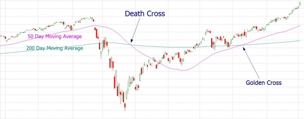
- A Golden Cross is a bullish signal and occurs when a short term moving average, most commonly a 50 Day moving average, crosses up over a longer-term moving average, most commonly the 200 Day moving average (see Figure 1).
- A Death Cross is a bearish signal and occurs when a short term moving average, most commonly a 50 Day moving average, crosses down and below a longer-term moving average, most commonly the 200 Day moving average (see Figure 1).
A search of these terms on your preferred web browser will produce a range of articles and images of these types of crosses and how they can be applied but my focus here is to review these crosses for the SPX and XJO and to assess how useful they are in predicting any longer-term trend.
Figure 1: Death versus Golden Cross
SPX analysis:
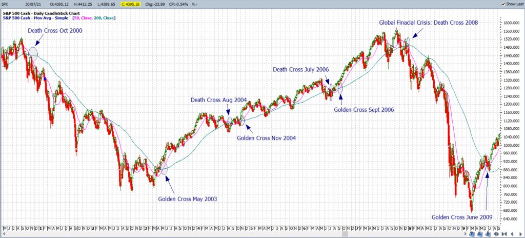
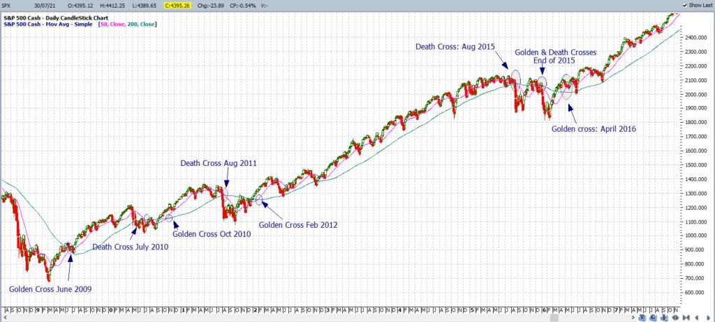
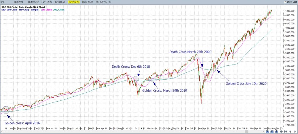
This analysis of the SPX Death and Golden Crosses extends back to the year 2000. Screen shots covering this period are shown across Figures 2, 3 and 4.
Figure 2: Death/Golden Cross SPX 2000-2009
Figure 3: Death/Golden Cross SPX 2009-2016
Figure 4: Death/Golden Cross SPX 2016-current
Inspection of the charts of the SPX from 2000 to current time, in Figures 2, 3 and 4, reveals that there have been a number of Death and Golden Crosses but it is also useful to look at the duration of each of these periods.
I have trawled through the SPX chart and tallied the number of both Death and Golden Crosses as well as the approximate number of months that each period lasted. This data can be found in Table 1 for SPX Death Crosses and Table 2 for SPX Golden Crosses. This might seem like a rather tedious task, and it was, but I would like to point out that I am currently, like all the people of Greater Sydney in NSW, starting the 7th week of a Covid-inspired lock down and, so, tedious has been rather useful at the moment!
Table 1: Duration of SPX Death Crosses
| Date of Death Cross | Duration of Death Cross (months) |
| Oct 2000 | 31 |
| Aug 2004 | 3 |
| July 2006 | 2 |
| Dec 2007 | 18 |
| July 2010 | 3 |
| Aug 2011 | 5 |
| Aug 2015 | 4 |
| Dec 2018 | 4 |
| March 2020 | 4 |
| Tally of all months
|
74 |
| Average Length of Death Cross (in months) | 8.2 months average |
Table 2: Duration of SPX Golden Crosses
| Date of Golden Cross | Duration of Golden Cross (months) |
| May 2003 | 15 |
| Nov 2004 | 20 |
| Sept 2006 | 15 |
| June 2009 | 13 |
| Oct 2009 | 9 |
| Feb 2012 | 42 |
| April 2016 | 31 |
| March 2019 | 12 |
| July 2020 (current) | 12 (current) |
| Tally of all months
|
169 |
| Average Length of Golden Cross (in months) | 18.8 months average |
There are a few points that I would like to point out about this data.
- Firstly, there have been 9 Death and 9 Golden Cross periods for the SPX in the 20 year span from 2000 to current time.
- Secondly, bullish Golden Cross periods for the SPX tend to last longer, on average, than bearish Death Cross periods. The average for SPX Golden Cross periods is about 18.8 months and the average for the Death Cross is about 8.2 months.
- Finally, the SPX is currently enjoying a period of a Golden Cross and the duration, thus far, is of about 12 months. This may have seemed like a long run when analysed in isolation but, when placed in context of these averages, it is rather modest. This current 12 month Golden Cross period is shorter than the average SPX Golden Cross period of 18.8 months and well short of the previous longest Golden Cross period, from April 2016, that went for 31 months.
XJO analysis:
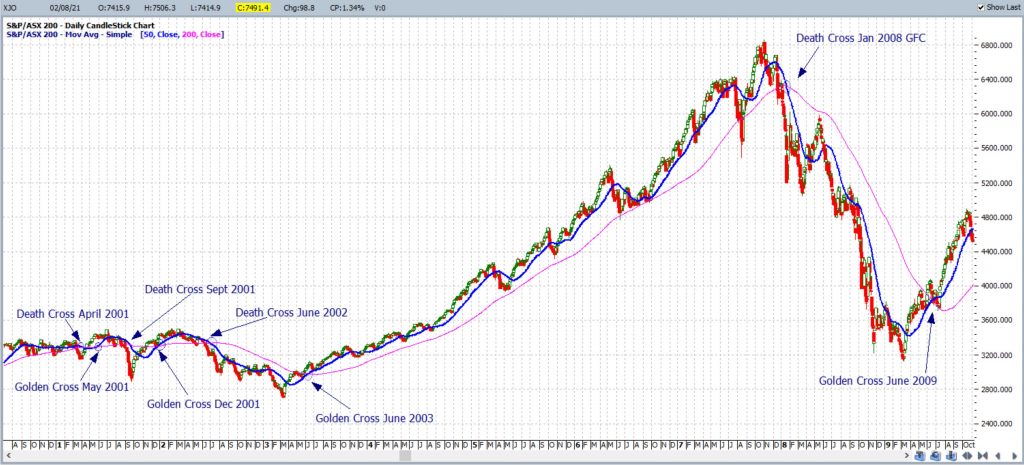
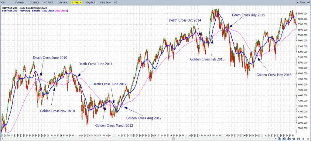
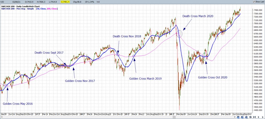
In a similar format to that of the SPX, analysis of the XJO Death and Golden Crosses extends back to just after 2000. Screen shots covering this period are shown in the Figures 5, 6 and 7.
Figure 5: Death/Golden Cross XJO 2009-2016
Figure 6: Death/Golden Cross XJO 2009-2016
Figure 7: Death/Golden Cross XJO 2016-current
Tallies of the XJO were carried out, as per those of the SPX, for the number of both Death and Golden Crosses and the approximate number of months that each period lasted. This data can be found in Table 3 for XJO Death Crosses and Table 4 for XJO Golden Crosses.
Table 3: Duration of XJO Death Crosses
| Date of Death Cross | Duration of Death Cross (months) |
| Apr 2001 | 2 |
| Sept 2001 | 3 |
| June 2002 | 12 |
| Jan 2008 | 17 |
| June 2010 | 5 |
| June 2011 | 9 |
| June 2012 | 2 |
| Oct 2014 | 4 |
| July 2015 | 10 |
| Sept 2017 | 2 |
| Nov 2018 | 4 |
| March 2020 | 7 |
| Tally of all months
|
77 |
| Average Length of Death Cross (in months) | 6.4 months average |
Table 4: Duration of XJO Golden Crosses
| Date of Golden Cross | Duration of Golden Cross (months) |
| May 2001 | 4 |
| Dec 2001 | 6 |
| June 2003 | 55 |
| June 2009 | 12 |
| Nov 2010 | 7 |
| March 2012 | 3 |
| Aug 2012 | 26 |
| Feb 2015 | 5 |
| May 2016 | 16 |
| Nov 2017 | 12 |
| March 2019 | 12 |
| Oct 2020 (current) | 9 (current) |
| Tally of all months
|
158 |
| Average Length of Golden Cross (in months) | 13.2 months average |
There are a few points that I would like to highlight about this XJO data.
- Firstly, there have been 12 Death and 12 Golden Cross periods for the XJO in the 20 year span from 2001 to current time.
- Secondly, as with the SPX, bullish Golden Cross periods for the XJO tend to last longer than the bearish Death Cross periods. The average for the XJO Golden Cross is about 13.2 months and the average for the Death Cross is about 6.4 months.
- Finally, as with the SPX, the XJO is currently enjoying a period of a Golden Cross and the duration, thus far, is of about 9 months. This is shorter than the average XJO Golden Cross period of 13.2 months and well short of the previous longest XJO Golden Cross period, from June 2003, that went for 55 months!
Conclusions:
There are a few conclusions that can be drawn from analysis of Death and Golden Crosses on both the SPX and XJO stock indices (based on this twenty year section of data):
- The first major conclusion is that, based on the period of this study, these instruments tend to experience longer periods of bullish Golden Cross behaviour than bearish Death Cross behaviour. Of course, this data only covers a twenty year period and so would need to be extended further for a more accurate extrapolation. This would be rather time consuming but, if Covid lock-down keeps being extended, I might just be up for the task!
- The second major conclusion is that observation of Death and Golden Crosses offers investors and traders a potential valuable clue about market direction. Long term, or buy and hold, investors and traders could use these crosses to help decide when to stay invested in the market: They may choose to remain invested during periods of a Golden Cross and revert to cash, and stay on the sidelines, when there are periods of a Death Cross.
- The third major conclusion is that the current bullish run on both the SPX and XJO fall well short of the average length of a Golden Cross for each index and, also, well short of the previous longest Golden Cross period for each index. Based on this data it is entirely plausible that the current bullish run on the SPX and XJO could continue for more months!
Final Comments:
My aim here was to enlighten readers about the concept and use of Death and Golden Crosses and this chart pattern was explored on the American SPX and Australian XJO stock indices. I would urge all traders and investors to explore this technical pattern on their own charting software and on trading instruments of their preference. The current bullish rallies on both the SPX and XJO have extended for many months and some investors might be expecting fatigue to set in. However, an observation of Death and Golden crosses, based on previous chart behaviour, suggests there could be more room for these rallies to run. If nothing else, I hope this article helps readers to remain objective and keep an open mind with their chart analysis.


