This page contains information about FX Index Divergence:
FX Ichimoku Cloud Divergence: By this I mean that the Index charts are NOT aligned for either ‘risk on’ or ‘risk off’. During Cloud Divergence you will notice price on the indices being in a more random configuration with respect to price being above or below the Ichimoku Cloud. There will be no overall bias, clear direction or pattern.
Ichimoku Cloud Divergence often results in:
- Fewer TC signals on 4hr time frame.
- Better and more reliable TC signals off shorter time frame 15 min charts during the US session.
- Less reliable TC 4hr trend signals.
- Shorter duration trends from any TC signals.
- A choppier and riskier trading environment.
Example Feb 2018:
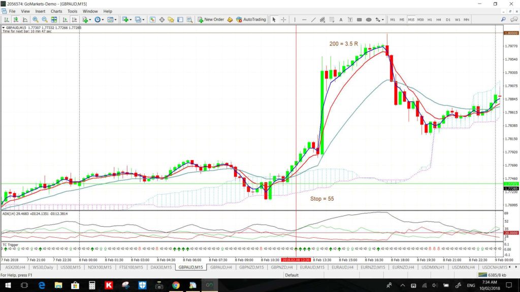
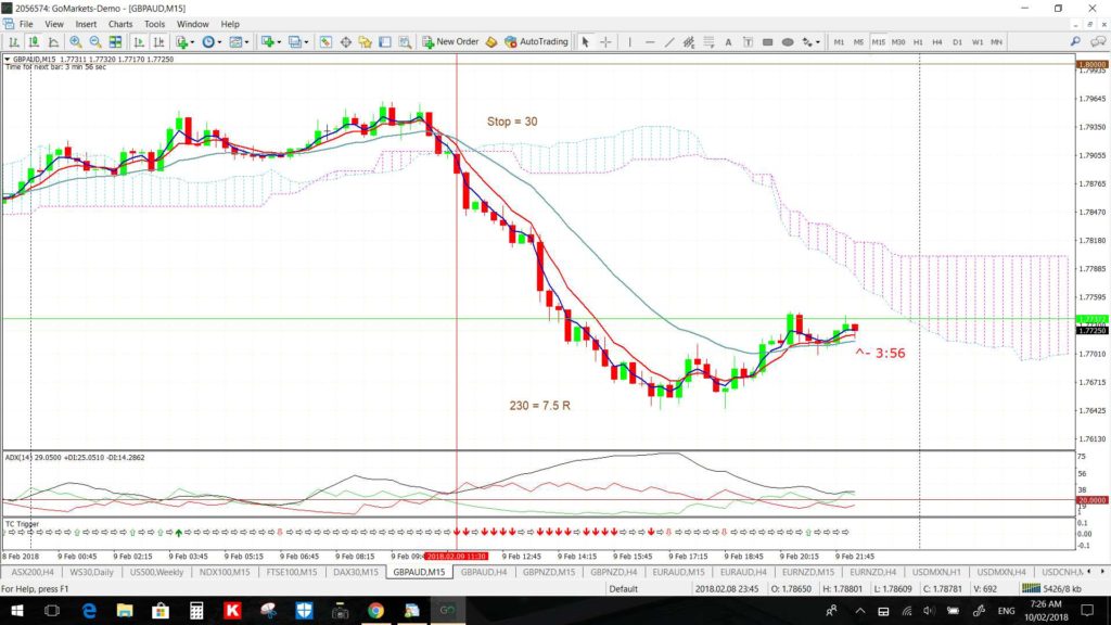
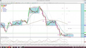
The second week of February was a period where the FX Indices were divergent. Such periods are often defined by having better trading coming off the shorter time frame charts and often off the cross pairs. Two of the better signals from the week came off the 15 min charts and both came from the GBP/AUD cross pair.
I had warned about the 1.80 level in my analysis last weekend and the first TC signal was from a move up to test this level for up to 200 pips. Then, on Friday, there was another TC signal when this level was rejected for a move up to 230 pips. That is two TC trades for 3.5 R and 7.5 R respectively and up to 430 pips!
GBP/AUD 15 min: the first TC signal gave a 3.5 R trade:
GBP/AUD 15 min: the second TC signal gave a 7 R trade:
Example December 2016:
Ichimoku divergence was note on December 3rd in my weekly FX Index update and there were great 30 min chart trades that triggered on the following Monday:
EUR/USD 30 min: gave 130 pips and is back above 1.07. If the US$ retreats back below 100 then we may have seen the lows here:
EUR/AUD 30 min: gave 150 pips. Watch today with the RBA rate update:
EUR/JPY 30 min: gave 220 pips:
AUD/USD 30 min: gave 40 pips. Watch today with the RBA rate update:
USD/TRY 30 min: I Tweeted on Tuesday 6th to watch for any trend line breakout on the USD/TRY and this evolved during the late Europe/US session and gave around 700 pips. The chart from my initial Tweet and then following the breakout (b/o) move are shown below:
Before b/o:
After b/o:
Further signals were triggered during Wednesday’s 7th December European and US sessions:
Gold 30 min:
Silver 30 min: 40 pips here:
DJIA 30 min: 250 pips
FTSE 30 min: a huge run here!
ASX-200 30 min: 320 here:
DAX 30 min: a huge haul here too:
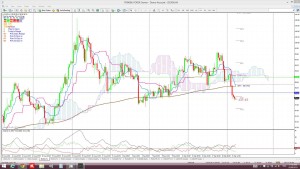
USD/TRY: this tested and broke the 3.40 level as discussed per yesterday’s article. Note the move below the 4hr Cloud. I suspect 3.40 would be tested again before any potential bearish follow through and 3.10 would be an ultimate target to test:
USD/TRY 15 min:
Example September 2015:
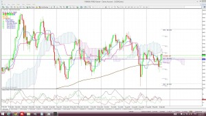
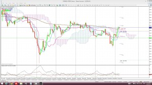
I noted this morning how the FX indices charts were divergent on their 4hr and daily time frames and that this is a warning for FX traders of EUR and US$ based pairs.
USDX daily Cloud: price is below the daily Cloud:
USDX 4hr Cloud: price is above the 4hr Cloud, hence, the divergence.
EURX daily Cloud: price is dipping into the daily Cloud:
EURX 4hr Cloud: price is below the 4hr Cloud, hence, the divergence for the time being. That is, until price drops below the daily Cloud:
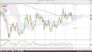
This kind of FX Index divergence often creates choppy trading conditions on the 4hr charts and better conditions on the 30 min charts during the US session. The following 30 minute chart of the EUR/USD is further evidence towards this observation. The last two trading sessions have offered much better trading during the US session off the shorter time frame charts.
E/U 30 min:
Example April 2012:
EURX and USDX: April 2012 was a very choppy period for trend trading from the 4hr charts. During this period price action on both the EURX and USDX was embedded in the Ichimoku Cloud on the daily time frames. Price was embedded in the Cloud for much of the month on the EURX and USDX for the 4hr time frame as well.
Currency pairs: All of the major pairs revealed very choppy patterns throughout this time frame.
Example Feb – May 2013:
30 minute chart trades from the US session:
This 4 month period of choppy markets presented many opportunities for better trading from the 30 minute charts during the US trading session. Many of these opportunities came on the S&P500 where SPY day trades were possible. Other opportunities also came from the main currency pairs. Some examples of these from mid May are shown below:
E/U 100 pips
E/J: 150 pips
A/U: 150 pips
G/U 70 pips
U/J: the star of the night @ 150 pips


