Stocks market investors have been a bit rattled this week amid fear surrounding the winding back of US stimulus and potential of rising interest rates. Rising yields have investors worried but, as my husband reminded me this morning, money has to flow somewhere. This conversation drew me to pull up the chart of Citigroup for a review and, as a consequence, I wonder if this could be one stock that just might enjoy an environment of higher yields!
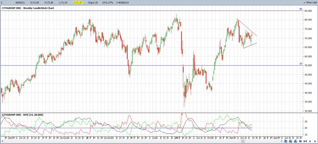
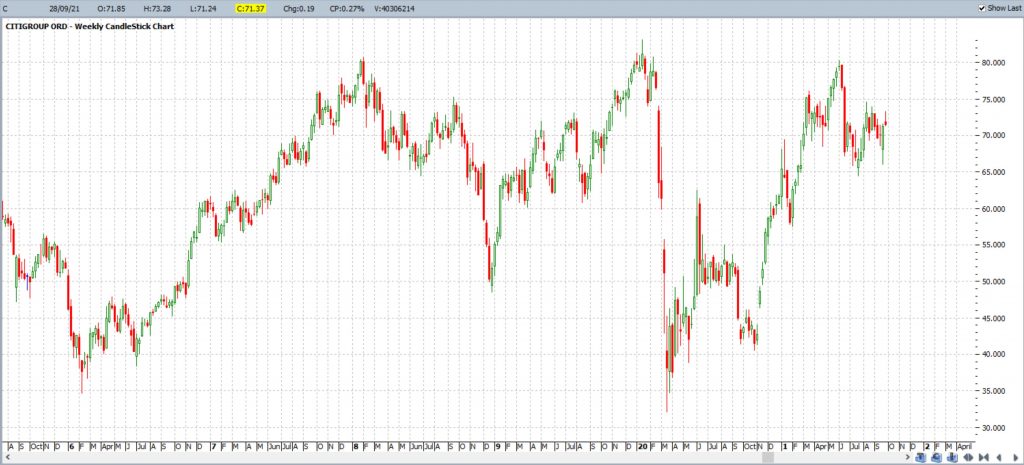
Citigroup weekly: I approach technical analysis from a top-down perspective and start with the weekly and monthly charts. The chart below shows the weekly chart of Citigroup and how, like so many stocks, it has enjoyed a decent 18-month recovery following the Covid-inspired dip of early 2020. Price action seems to have stumbled at the $85 resistance zone though over the last few years.
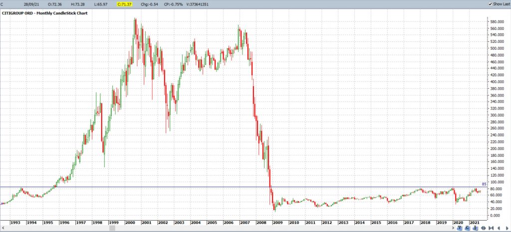
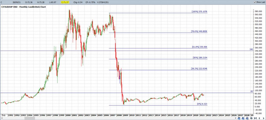
Citigroup monthly: the monthly chart is rather impressive and shows the lofty levels that this stock enjoyed prior to the 2007-2008 Global Financial Crisis. I have drawn in a horizontal level at the $85 mark as this is an upper resistance zone that has been effective both prior to and since this period of financial collapse.
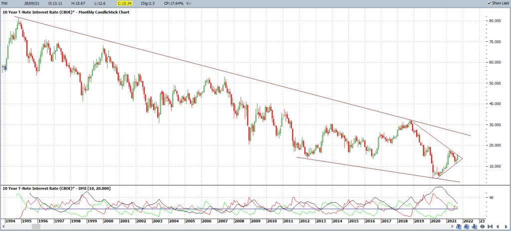
TNX monthly: The chart below shows the monthly chart of the 10 Year Treasury Yield and the overall pattern looks to be one of a bullish-reversal descending wedge. More recently, price action has been consolidating within a triangle, within this broader wedge, but overall momentum, assessed by way of the ADX indicator in the bottom pane, remains low and declining for the time being. Many traders and analysts will be watching for any bullish trend line breakout here that evolves with supporting momentum by way of a rising ADX line (black line both rising and above the 20 level).
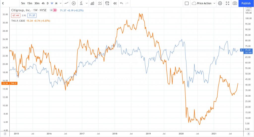
TNX versus Citigroup: One question I wanted sorted this morning during my analysis was to find out how the 10 Year Treasury Yield trades compared to Citigroup. The chart below shows that of Citigroup (blue line) overlaid with the 10 Year Treasury Yield (yellow line) and there is a high degree of positive correlation between the two. Thus, if yields do experience a period of bullish recovery then this could end up being be a supportive environment for Citigroup, as well as other bank stocks.
Citigroup monthly + Fibonacci: The next question was what technical / charting levels are worth monitoring with any potential Citigroup breakout? I like to use Fibonacci retracement as a guide in these circumstances and the monthly chart below has been overlaid with a Fibonacci retracement tool. The 61.8% Fibonacci is a popularly monitored level and this is up near a previous reaction zone, circa $340. Any break and hold above $85 would posit this as one, albeit mighty ambitious, target for any bullish advance.
Citigroup weekly: drilling back down to the weekly chart shows price action within a sideways consolidation pattern but also on low momentum. The plan here would be to watch for any trend line breakout that evolves with supporting ADX momentum:
Bullish breakout:
- ADX (black line): above 20 and rising
- +DMI (green line): above 20 and rising
Bearish breakout:
- ADX (black line): above 20 and rising
- -DMI (red line): above 20 and rising
Final comments:
Citigroup is currently trading in a sideways congestion pattern under a resistance level ($85) that has been in play since the steep stock decline triggered by the 2007-2008 Global Financial Crisis. Whilst many stocks are being undermined by the potential bullish rise with Treasury yields, Citigroup could be one stock that might benefit from such an environment. The resistance level to monitor is $85 but any break and hold above this region would bring the lofty region of $340 back into focus.


