Context:
I was asked by a new trader at a recent trading meeting about how to make a start with technical analysis and charting. This can be a most daunting exercise and there is no one way to approach this endeavour. However, in an effort to help this new trader and so that they would not be too overwhelmed, I suggested a particular approach to get them started and have documented this in the article below. Another trader, also new to charting, recently advised me they were going to spend the coming December holidays reading a thick tome full of information about a myriad of technical indicators. I beg to differ that this is the best approach to start a learning journey about Charting and Technical Analysis and believe that limiting initial focus to Price Action, Support / Resistance, Volume and Momentum are the key for any new chartist.
I also firmly believe in taking small steps in any learning process and being able to feel a certain degree of mastery along the way. My hope with this article is that it will enable traders, who are completely new to charting, to make a start on their own technical analysis journey and to easily develop a sense of some achievement as they progress. This is not intended to be a complete guide but, rather, one to get a new chartist on the road with their Technical Analysis learning journey.
NB: The chart used in this example is not the issue but, rather, the approach as to how to read and analyse a chart.
Step 1: Charting Software:
A new chartist will need access to charting software. I suggest Trading View as traders can trial this software for free for one month, but, any software that is not too complex will suffice. Please note that I am not affiliated with Trading View in any way other than being a relatively new paying customer! The choice of charting software is purely personal preference. I have also used Profit Source, by Hubb for a long time and I am very comfortable navigating this software but Profit Source does not support intra-day time frames and, so, I am a new user of Trading View as well. I still consider myself a novice with this platform!
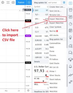
Once you have your charting platform up and running you will then need to populate this with a few stock, ETF or Futures tickers. For Trading View, you can do this manually or you can easily import a watch list using the following steps:
- Save your stock or ETF ticker watch list as a CSV file.
- Import this file into the Trading View software using the ‘Import Watch list‘ option from the right hand side of the charting screen:
Step 2: Open a monthly chart:
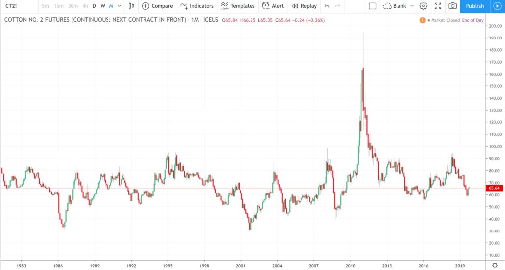
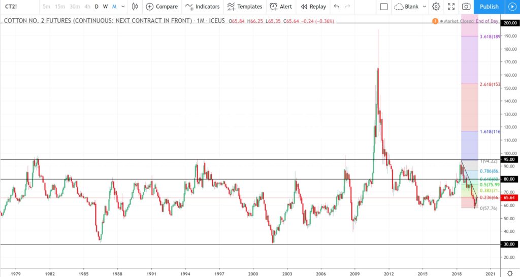
Once you have some ticker symbols loaded in your software you are ready to start. Open any chart of choice to a monthly time frame. There is no need for any indicators here just the basic price action chart. My preference is for candlestick charts but feel free to use any kind of price action chart that you want. In the example below I have used the monthly chart of Cotton Futures.
Once you have the monthly chart up in front of you have a good look at it and see if you can identify any HORIZONTAL areas where price tends to react; by this I mean a region where price can be seen to bounce back down, or, bounce back up on multiple instances. These are referred to as
- Support if they are at the bottom of price action and from where price bounces up.
- Resistance if they are at the top of price action and from where price bounces down.
Have a look at the chart below and see if you can identity and Support and / or Resistance levels:
Step 3: Mark the monthly chart with horizontal Support / Resistance levels:
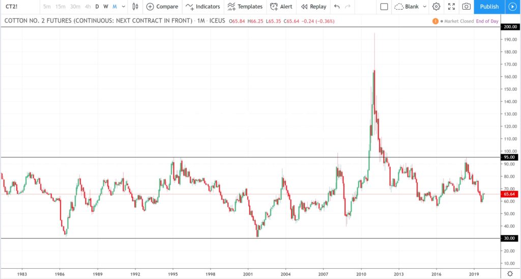
I identified at least three levels that seemed to ‘jump out’ at me and I have noted these on the chart below.
- $200 Resistance: this is a Resistance zone, of a sort, as it only had one near touch but is the whole number level above the maximum price ever reached so it is worth marking as Resistance. Whole-number levels are often significant zones on charts.
- $95 Resistance: this is another horizontal level where price seems to react quite frequently. Note how price often reaches up to this region and then bounces back down. I think this is worth noting as Resistance.
- $30 Support: this is another horizontal level where price seems to react quite frequently. Note how price often reaches down to this region and then bounces back up. I think this is worth noting as Support.
You might note some other major levels but this is probably enough here for now. It is important to note that there is no right or wrong response here. It is your chart and your analysis and whatever you see is valid, however, practice and time on task will help to make this activity easier over time.
Step 4: Drop down from monthly to weekly time frame:
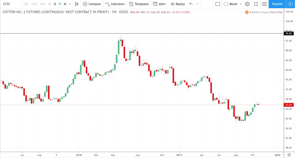
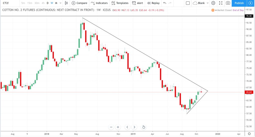
Drop down to a weekly time frame and try to capture all of the recent price action. Then, have a good look at the chart and try to note any angled trend lines that capture price action. It is always best to have price action touch these trend lines in 3 places or more. This will depend on the time frame however: a chart with two touches on a monthly time frame might end up being multiple touches on a lower time frame.
Step 5: Mark the weekly chart with angled Support / Resistance levels:
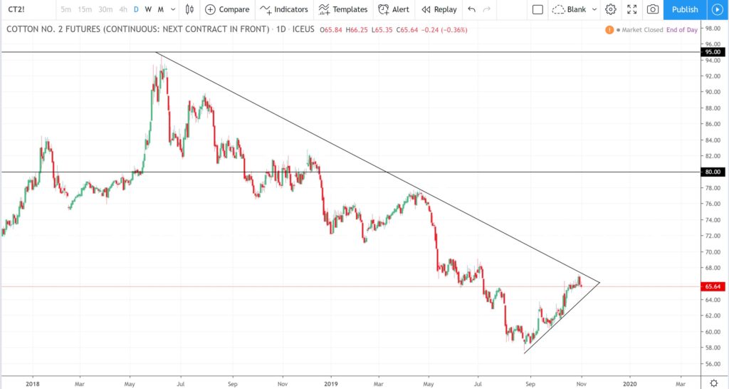
Once you consider you have identified some areas where angled trend lines might be placed, go ahead and draw these on your chart. I always suggest that traders try and identify any areas of congestion or consolidation. In the chart below I have noted two angle trend lines that touch price action multiple times. The resultant pattern is referred to as a Symmetrical Triangle for obvious reasons! Symmetrical Triangles capture a type of sideways congestion and price action can just as easily breakout to the upside as the downside.
Step 6: Use Fibonacci retracement tool to help identify a breakout target:
I always like to look for an obvious target for any pullback should price make a trend line breakout to the upside out of a congestion pattern. There is no guarantee here, though, and price could just as easily breakout to the downside.
However, if price does breakout to the upside then I find the Fibonacci retracement tool to be rather useful to help identity targets and these might then be where you set your ‘Take Profit‘ on a trade.
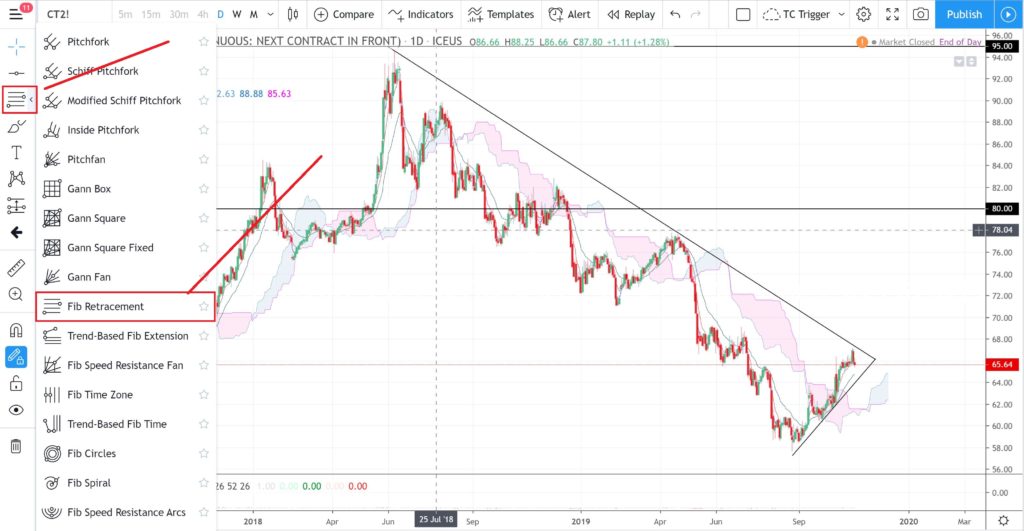
There are many indicators to choose from on Trading View, as with any trading software, so I have highlighted the particular tab button to select for the Fibonacci retracement: it is on left hand side and the third option from the top:
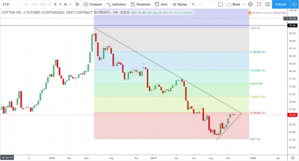
This tool takes a bit of getting used to but is applied from the top of the candle at the top of the last High down to the bottom of the candle at the last Low. This type of essentially continuous move down, albeit in stops and starts, is referred to as a Swing Low move. Note how I have applied the Fibonacci retracement to the Swing Low move on the chart below.
This Fibonacci Retracement tool labels certain percentage-wise steps on the chart from the mapped High to the mapped Low. The choice of these particular values is a subject all on its own but, suffice to say for here that, the most popular level to monitor is the 61.8% level. This is not a magical level but one that often features prominently due to herd mentality; because so many other traders use this tool and focus on this particular level.
Step 7: Note S/R near the 61.8% Fibonacci level:
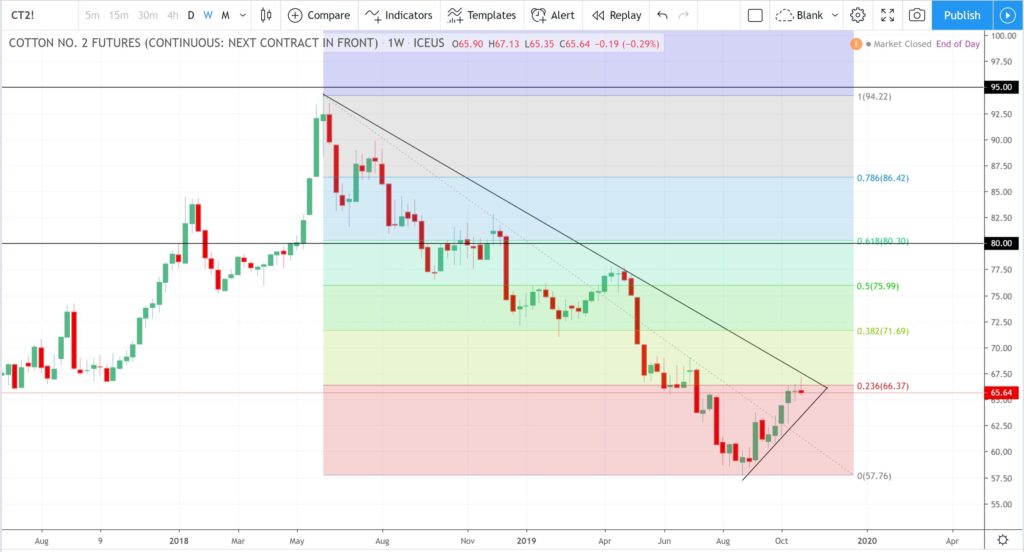
Once you have noted the location of the 61.8% Fibonacci, then, look to see if there is any horizontal Support or Resistance zone near this level. If so, draw it in! I note that the whole-number $80 is near the 61.8% fib and also seems to a region where price action often reacts. So I have added a horizontal line at the $80 level on the chart.
My plan is starting to evolve now: if I see price action break out to the upside of this triangle pattern then I would anticipate this breakout could extend up to this $80 confluence region given it is near the popular 61.8% Fibonacci level and is also a region of previous Support/Resistance. My Take Profit target, for any upside breakout move, is shaping up to be the $80 level:
Step 8: Confirm this new S/R zone:
It is worth scrolling back out to the monthly chart to check on this noted new confluence zone. Observe how the $80 is, indeed, another key level where price has reacted multiple times in the past. This gives me more confidence in using this as a potential Take Profit target.
Step 9: Drop down to the daily chart:
Drop down to the daily chart to then monitor this triangle pattern over the coming days and weeks. However, you will need to decide whether you want to see a weekly candle breakout or daily candle breakout as your confirmation for any trading signal. Personally, I like to see a weekly candle breakout.
Step 10: Trial / Add other Indicators.
This step is entirely optional. There are many indicators that traders can choose from; just as there are many ways to skin a cat! I have my own personal preference that has evolved over the years of my trading journey. New traders might like to take some time experimenting with the application of different indicators to see if they help them at all, however, I believe that Volume and Momentum indicators would be the best ones to start with. I have written a separate article on the application of Momentum and Volume and this can be found through the following link.
I am particularly keen on watching to see if Momentum supports any trend line breakout. For me, this is on par with monitoring Volume which some traders prefer and I do have templates with Volume as well. Trading View, as most platforms do, allow you set up multiple templates so you might have one template with just price action and trend lines and other templates with Volume or Momentum etc. This is where individual Trial and Error comes into the charting; that is, it becomes a matter of personal preference.
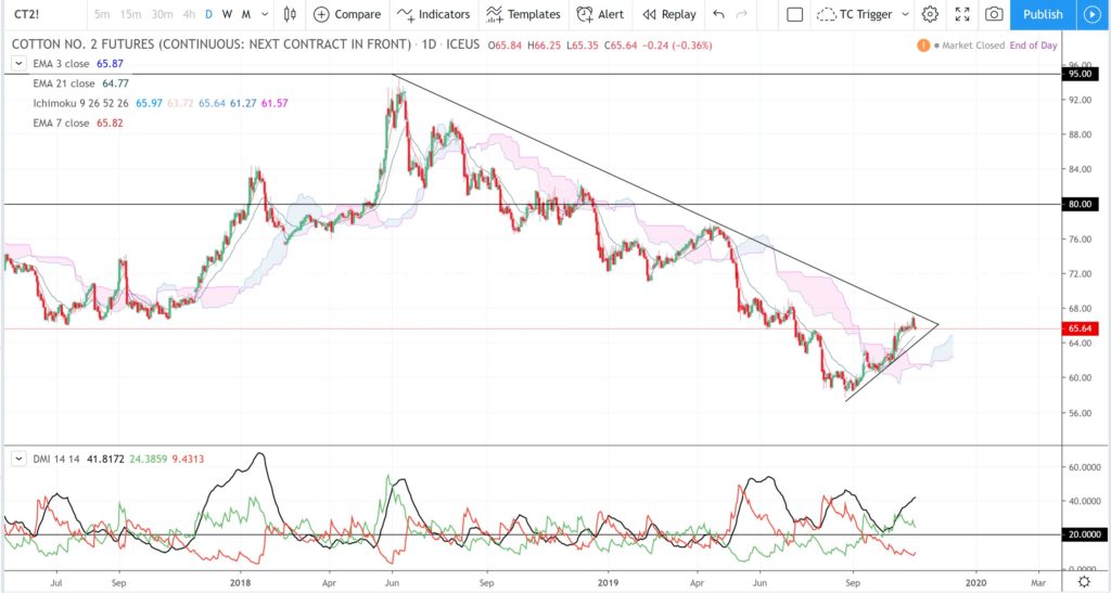
My Momentum indicator of choice is the ADX: Average Directional Index with +DMI and -DMI. I also like knowing where the Ichimoku Cloud is with respect to price action as I see this a fluid form of Support /Resistance. For the chart below I can already see that Momentum is up although bullish Momentum, the green line, has recently waned. Price action is above the resistance of the daily Ichimoku Cloud and so that is positive. I would now watch for any weekly trend line breakout that evolves with an uptick of bullish (green line) momentum!
Step 11: Summing Up:
Now that I have completed my technical analysis of this chart I am in a position of more confidence to attempt any new trade.
I would be waiting for a momentum-based, weekly candle breakout from this triangle pattern. By this I mean that I would want to see a candle close outside of this triangle; either to the upside or downside. If the breakout was to the upside then I would choose to go LONG or BUY this instrument. My Take Profit target would be $80 and I would risk no more than 2% of my trading account.
There is a lot more to charting, and indeed trading, than what I have revealed in this very short introductory article but I believe this framework provides the core elements on which to start a study of Technical Analysis and Charting.
It is important to keep in mind that there are no guarantees of any outcome here; Charting and Technical Analysis are simply tools to help you make your trading decisions. Trade and Risk Management are other fundamentally important matters to address and are critical to the survival of any trader. However, these would need to be the topic of a whole new article!
Concluding Comments:
There are many and varied ways to approach Technical Analysis and Charting and numerous great tomes on this topic can be found with a search on your preferred search engine. However, I believe that this process can be simplified for new analysts into a few steps that are not too daunting and that can be easily practiced. The approach offered in this article is not exhaustive but is meant to offer a framework for new traders to start them on their Technical Analysis and Charting learning journey.


