Introduction:
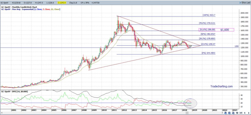
Gold has been chopping sideways within a $200 +/- range either side of the $1,200 level since early 2013 but the monthly chart shows declining momentum during this time. A majority of Gold stocks have been beaten well down since the heady days of 2011 when the price of the Gold peaked near $1,925 and many stocks are trading down near, or just off, their all-time Lows. However, with the first example of a US yield curve inversion today, 04/12/18, it might be worth taking a closer look at the charts of Gold, and some Gold stocks and ETFS, to assess technical levels worth watching in case there is some recovery in the precious metal sector.
NB: This is a copy of an article prepared for publication in the January / February edition of the trading magazine: Your Trading Edge.
In this article I use technical analysis to assess the monthly and weekly charts of Gold and the weekly charts of a number of USA traded Gold stocks and ETFs. There is one common theme with all the charts of these stocks and ETFS; they all show price action in decent decline since 2011 but trading off, or near, recent Lows in consolidation-style technical patterns giving me trend lines to monitor for any momentum-based breakout. With my analysis I use:
- Trend lines and a momentum indicator, the ADX, to help assess for any breakout activity and;
- Fibonacci retracement, along with previous Support and Resistance levels, to help assess price action targets for any momentum-based trend line breakout move; bullish or bearish.
Gold monthly:
Figure 1 below shows the monthly chart of Gold and how price action has chopped sideways, either side of $1,200, since early 2013. Note the overall lack of momentum here though as the chart shapes up with a symmetrical triangle. Gold price is edging closer to the apex of this triangle so watch the trend lines for any new momentum-based breakout; either up or down.
- Bullish breakout: would have me looking to the monthly 61.8% Fibonacci level, up near $1,600, which is previous Support / Resistance (S/R).
- Bearish breakout: would have me looking to the recent swing Low, down near $700.
Figure 1: Gold monthly
Gold weekly:
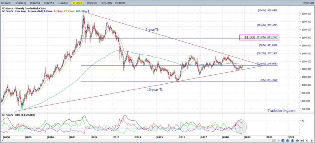
The weekly chart, shown in Figure 2, gives an expanded view of the monthly chart but it also shows that recent bearish momentum is declining. I’m on the lookout for any potential uptick with bullish momentum and for any new momentum-based trend line breakout. Targets as per those described above on the monthly time frame.
Figure 2: Gold weekly
Gold Miners ETF: GDX
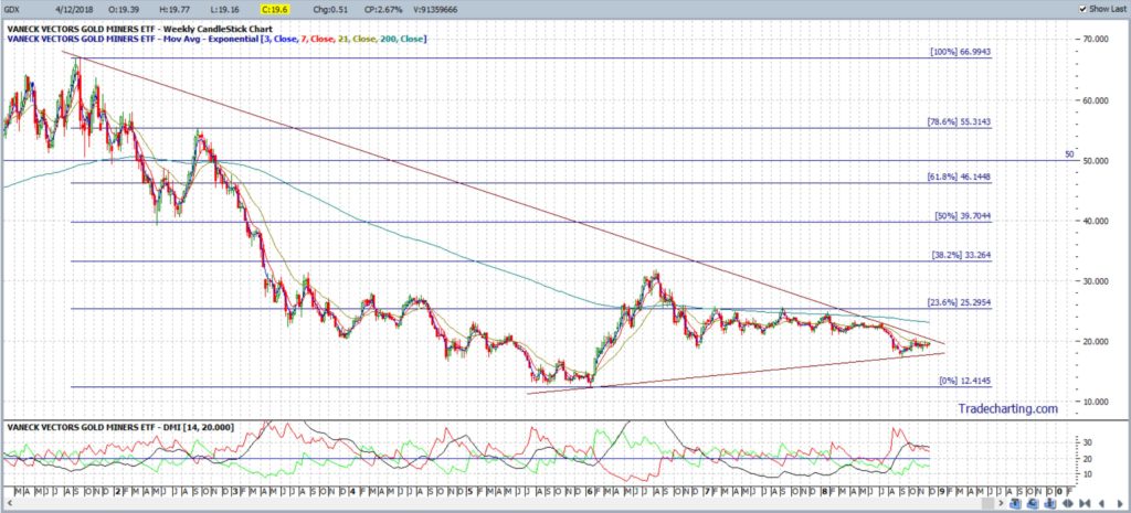
The Gold miner’s ETF, GDX, has been in a downtrend since 2011, carved a bottom in 2016 and is currently trading just off the 2016 Low. This is giving the weekly chart, shown in Figure 3, a consolidation-style symmetrical triangle appearance but with price action trading very close to the apex. I’m watching for any momentum-based trend line breakout:
- Bullish breakout: would have me looking up to the weekly 61.8% Fibonacci level, near the $50 whole-number level, which is also previous S/R.
- Bearish breakout: would have me looking to the recent Low, near the $12.40 region.
Figure 3: GDX weekly
Junior Gold Miners ETF: GDXJ
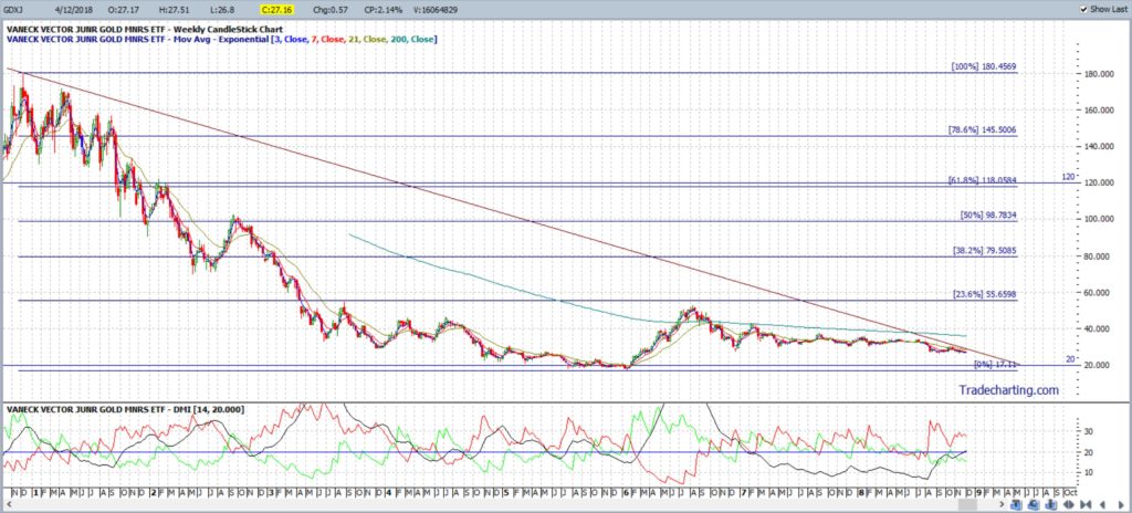
The weekly chart of the Junior Gold Miners ETF, GDXJ, is shown in Figure 4 and is a bit similar to that of GDX. Price action pulled back after 2011 and has been consolidating just above the $20 level since 2016 giving this chart more of a descending triangle appearance. Watch for any momentum-based trend line breakout:
- Bullish breakout: would have me looking up to the weekly 61.8% Fibonacci level, near the $120 whole-number level, which is also previous S/R.
- Bearish breakout: any break below $20 would have me looking to the recent Low, near the $17 region.
Figure 4: GDXJ weekly
Gold ETF: GLD
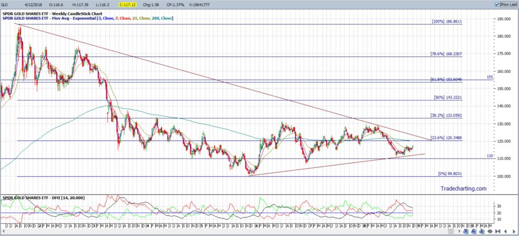
The weekly chart of the Gold ETF, Figure 5, shows that price action declined from 2011 to 2016 but is trading off the 2016 Low giving the chart a symmetrical triangle appearance. I’m watching for any momentum-based trend line breakout:
- Bullish breakout: would have me looking up to the weekly 61.8% Fibonacci level, near the $155 whole-number level, which is also previous S/R.
- Bearish breakout: would have me looking to the recent Low, near the $100 region.
Figure 5: GLD weekly
Barrisk Gold: ABX
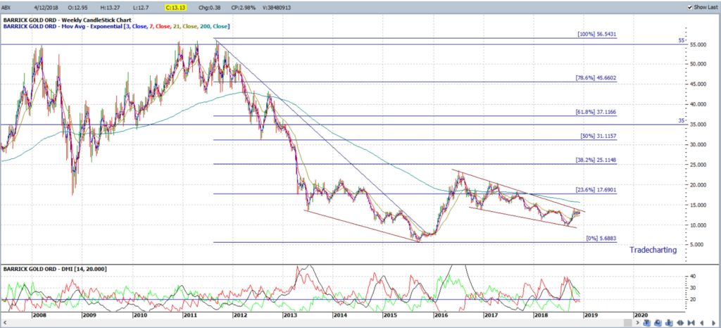
Barrick Gold is trading well of its 2011 High, circa $55. The weekly chart, in Figure 6, shows that there was a bullish breakout from a descending wedge but this move paused and has set up another consolidation-style descending wedge pattern. I’m watching for any momentum-based trend line breakout:
- Bullish breakout: would have me looking up to the weekly 61.8% Fibonacci level, near the $35 whole-number level, which is also previous S/R.
- Bearish breakout: would have me looking to the recent Low, near the $5.50 region.
Figure 6: ABX weekly
Yamana Gold: AUY
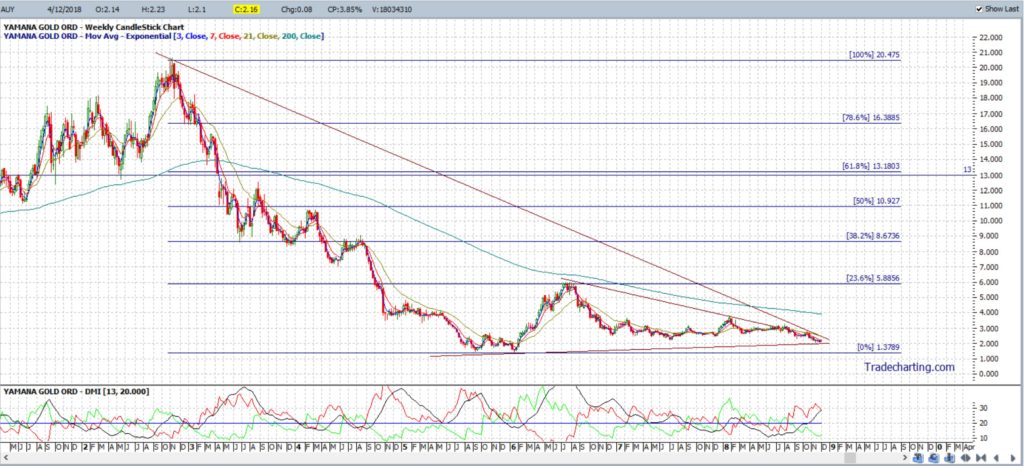
Yamana Gold price peaked in late 2012 at around the $20 level but declined to near $1.50 by the start of 2016, as shown in Figure 7 below. Price action has been hovering above this Low since then and has formed up within a symmetrical triangle and is now trading very near the apex of this chart pattern. I’m watching for any momentum-based trend line breakout:
- Bullish breakout: would have me looking up to the weekly 61.8% Fibonacci level, near the $13 whole-number level, which is also previous S/R.
- Bearish breakout: would have me looking to the recent Low, near the $1.50 region.
Figure 7: AUY weekly
Eldorado Gold: EGO
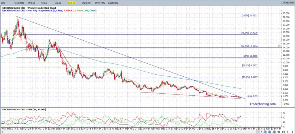
The weekly chart of Eldorado Gold, Figure 8, shows price has been in a steady decline since 2011 but, rather surprisingly, is shaping up within a bullish-reversal descending wedge pattern. I’m watching for any momentum-based trend line breakout:
- Bullish breakout: would have me looking up to the weekly 61.8% Fibonacci level, near the $14 whole-number level, which is also previous S/R.
- Bearish breakout: there isn’t much room below the bottom trend line.
Figure 8: EGO weekly
GoldCorp: GG
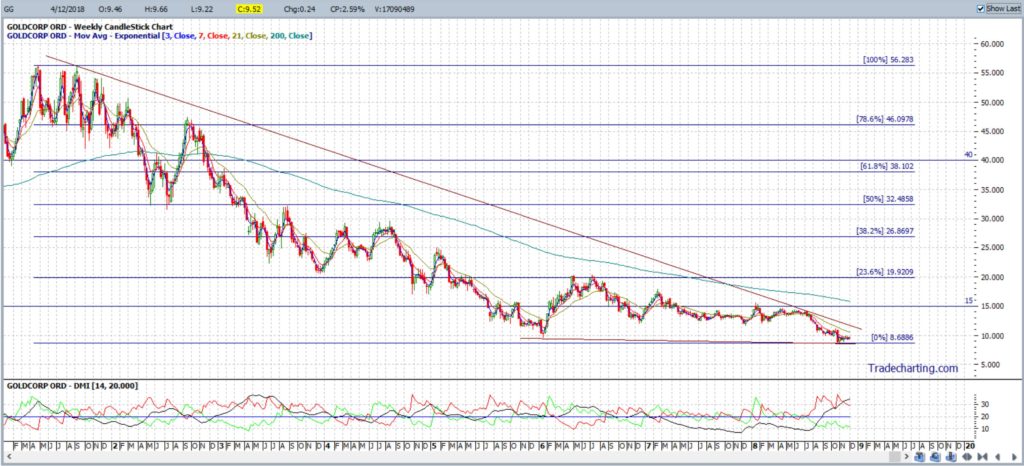
The price action in the weekly chart of GoldCorp, Figure 9, is rather similar to that of Eldorado Gold in that I’m seeing a potential bullish-reversal descending wedge. I’m watching for any momentum-based trend line breakout:
- Bullish breakout: would have me looking up to the weekly 61.8% Fibonacci level, near the $40 whole-number level, which is also previous S/R.
- Bearish breakout: would have me looking to the $5 region.
Figure 9: GG weekly
Hecla Mining: HL
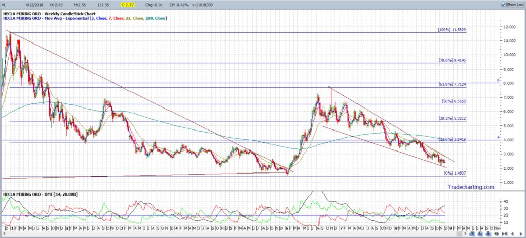
The weekly chart of Hecla Mining, Figure 10, shows price action declined from 2011 to 2016 but recovered up to the weekly 61.8% Fibonacci level following a bullish breakout. Price action has since pulled back but is now shaping up in another technical pattern. This time HL is trading within a bullish-reversal descending wedge. I’m watching for any momentum-based trend line breakout:
- Bullish breakout: would have me looking back up to the weekly 61.8% Fibonacci level, near the $8 whole-number level, which is also previous S/R.
- Bearish breakout: would have me looking to the recent Low, near the $1.45 region.
Figure 10: HL weekly
Harmony Gold Mining: HMY
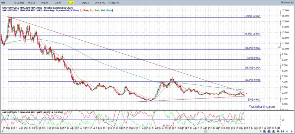
The weekly chart of the Harmony Gold, Figure 11, shows price action declined from 2011 to 2016 but is trading off the 2016 Low which is giving the chart a symmetrical triangle appearance. Here, too, price is very near the apex. I’m watching for any momentum-based trend line breakout:
- Bullish breakout: would have me looking up to the weekly 61.8% Fibonacci level, near the $10 whole-number level, which is also previous S/R.
- Bearish breakout: would have me looking to the recent Low, near the $0.50 cents region.
Figure 11: HMY weekly
IAMGOLD: IAG
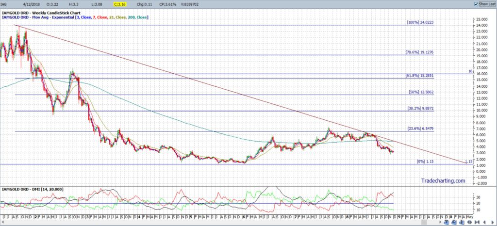
The weekly chart of the IAMGold, Figure 12, is a bit similar to Harmony Gold in that it shows price action declined from 2011 to 2016 but is trading just off the 2016 Low. The chart pattern here, though, is more of a descending triangle. I’m watching for any momentum-based trend line breakout:
- Bullish breakout: would have me looking up to the weekly 61.8% Fibonacci level, near the $16 whole-number level, which is also previous S/R.
- Bearish breakout: there isn’t much room below the bottom trend line.
Figure 12: IAG weekly
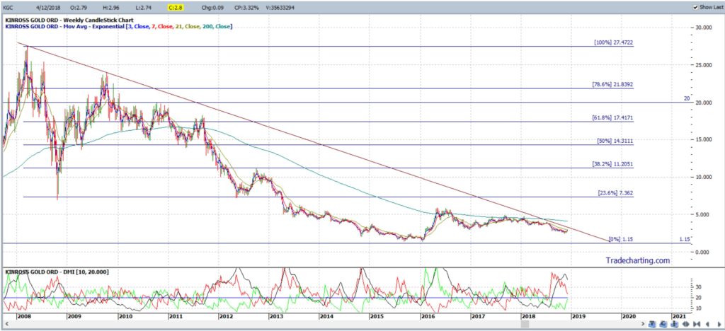
KINROSS Gold: KGC
The weekly chart of Kinross Gold, Figure 13, shows price in retreat from 2011 to 2016 and currently trading just off the 2016 Low in a descending triangle pattern. I’m watching for any momentum-based trend line breakout:
- Bullish breakout: would have me looking up to near the weekly 61.8% Fibonacci level, circa the $20 whole-number level, which is also previous S/R.
- Bearish breakout: there isn’t much room below the bottom trend line.
Figure 13: KGC weekly
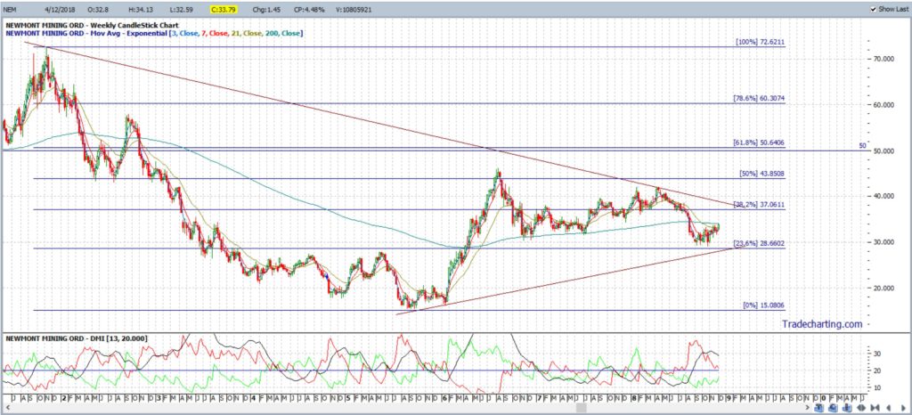
Newmont Mining: NEM
The weekly chart of Newmont Mining, Figure 14, shows price in retreat from 2011 to 2016 but currently trading well off the 2016 Lows in a symmetrical triangle pattern. I’m watching for any momentum-based trend line breakout:
- Bullish breakout: would have me looking up to the weekly 61.8% Fibonacci level, near the $50 whole-number level, which is also previous S/R.
- Bearish breakout: would have me looking to the recent Low, near the $15 region.
Figure 14: NEM weekly
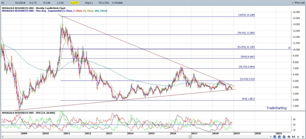
NovaGold Resources: NG
The weekly chart of NovaGold Resources, Figure 15, shows price action in retreat from 2011 to 2013 but currently trading off the 2013 Lows generating a symmetrical triangle pattern with price near the apex here too. I’m watching for any momentum-based trend line breakout:
- Bullish breakout: would have me looking up to the weekly 61.8% Fibonacci level, near the $10 whole-number level, which is also previous S/R.
- Bearish breakout: would have me looking to the recent Low, near the $1.80 region.
Figure 15: NG weekly
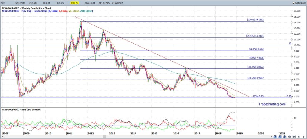
Newgold: NGD
The weekly chart of Newgold, Figure 16, shows price in retreat from 2011 and only recently reaching new Lows giving the chart a descending triangle appearance. I’m watching for any momentum-based trend line breakout:
- Bullish breakout: would have me looking up to near the weekly 61.8% Fibonacci level, circa the $10 whole-number level, which is also previous S/R.
- Bearish breakout: there isn’t much room below the bottom trend line.
Figure 16: NGD weekly
Summary: Gold has declined from its peak in 2011 and recent sideways price action has the precious metal consolidating in a monthly chart based symmetrical triangle pattern. Similar consolidation patterns are evident on a number of Gold stocks and ETFs giving traders trend lines to watch for any momentum-based breakout. Profit targets for any bullish breakout moves can be identified with the help of a Fibonacci retracement tool and, interestingly, the key 61.8% Fibonacci retracement level is located near previous Support and Resistance on all of the charts tabled within this post.
Please address any questions you may have about this post or analysis to mary@tradecharting.com.


